import matplotlib.pyplot as plt
import numpy as np
import seaborn as sns
%matplotlib inline부록: 그림 코드
이 텍스트 전체에 사용된 많은 그림은 인쇄된 코드에 의해 생성되었습니다. 그러나 일부 경우에는 필요한 코드가 너무 길어서(또는 즉시 관련성이 높지 않은 경우) 참조용으로 여기에 넣습니다.
import os
if not os.path.exists('figures'):
    os.makedirs('figures')
방송 중
# Adapted from astroML: see http://www.astroml.org/book_images/appendix/fig_broadcast_visual.html

#------------------------------------------------------------
# Draw a figure and axis with no boundary
fig = plt.figure(figsize=(6, 4.5), facecolor='w')
ax = plt.axes([0, 0, 1, 1], xticks=[], yticks=[], frameon=False)


def draw_cube(ax, xy, size, depth=0.4,
              edges=None, label=None, label_kwargs=None, **kwargs):
    """draw and label a cube.  edges is a list of numbers between
    1 and 12, specifying which of the 12 cube edges to draw"""
    if edges is None:
        edges = range(1, 13)

    x, y = xy

    if 1 in edges:
        ax.plot([x, x + size],
                [y + size, y + size], **kwargs)
    if 2 in edges:
        ax.plot([x + size, x + size],
                [y, y + size], **kwargs)
    if 3 in edges:
        ax.plot([x, x + size],
                [y, y], **kwargs)
    if 4 in edges:
        ax.plot([x, x],
                [y, y + size], **kwargs)

    if 5 in edges:
        ax.plot([x, x + depth],
                [y + size, y + depth + size], **kwargs)
    if 6 in edges:
        ax.plot([x + size, x + size + depth],
                [y + size, y + depth + size], **kwargs)
    if 7 in edges:
        ax.plot([x + size, x + size + depth],
                [y, y + depth], **kwargs)
    if 8 in edges:
        ax.plot([x, x + depth],
                [y, y + depth], **kwargs)

    if 9 in edges:
        ax.plot([x + depth, x + depth + size],
                [y + depth + size, y + depth + size], **kwargs)
    if 10 in edges:
        ax.plot([x + depth + size, x + depth + size],
                [y + depth, y + depth + size], **kwargs)
    if 11 in edges:
        ax.plot([x + depth, x + depth + size],
                [y + depth, y + depth], **kwargs)
    if 12 in edges:
        ax.plot([x + depth, x + depth],
                [y + depth, y + depth + size], **kwargs)

    if label:
        if label_kwargs is None:
            label_kwargs = {}
        ax.text(x + 0.5 * size, y + 0.5 * size, label,
                ha='center', va='center', **label_kwargs)

solid = dict(c='black', ls='-', lw=1,
             label_kwargs=dict(color='k'))
dotted = dict(c='black', ls='-', lw=0.5, alpha=0.5,
              label_kwargs=dict(color='gray'))
depth = 0.3

#------------------------------------------------------------
# Draw top operation: vector plus scalar
draw_cube(ax, (1, 10), 1, depth, [1, 2, 3, 4, 5, 6, 9], '0', **solid)
draw_cube(ax, (2, 10), 1, depth, [1, 2, 3, 6, 9], '1', **solid)
draw_cube(ax, (3, 10), 1, depth, [1, 2, 3, 6, 7, 9, 10], '2', **solid)

draw_cube(ax, (6, 10), 1, depth, [1, 2, 3, 4, 5, 6, 7, 9, 10], '5', **solid)
draw_cube(ax, (7, 10), 1, depth, [1, 2, 3, 6, 7, 9, 10, 11], '5', **dotted)
draw_cube(ax, (8, 10), 1, depth, [1, 2, 3, 6, 7, 9, 10, 11], '5', **dotted)

draw_cube(ax, (12, 10), 1, depth, [1, 2, 3, 4, 5, 6, 9], '5', **solid)
draw_cube(ax, (13, 10), 1, depth, [1, 2, 3, 6, 9], '6', **solid)
draw_cube(ax, (14, 10), 1, depth, [1, 2, 3, 6, 7, 9, 10], '7', **solid)

ax.text(5, 10.5, '+', size=12, ha='center', va='center')
ax.text(10.5, 10.5, '=', size=12, ha='center', va='center')
ax.text(1, 11.5, r'${\tt np.arange(3) + 5}$',
        size=12, ha='left', va='bottom')

#------------------------------------------------------------
# Draw middle operation: matrix plus vector

# first block
draw_cube(ax, (1, 7.5), 1, depth, [1, 2, 3, 4, 5, 6, 9], '1', **solid)
draw_cube(ax, (2, 7.5), 1, depth, [1, 2, 3, 6, 9], '1', **solid)
draw_cube(ax, (3, 7.5), 1, depth, [1, 2, 3, 6, 7, 9, 10], '1', **solid)

draw_cube(ax, (1, 6.5), 1, depth, [2, 3, 4], '1', **solid)
draw_cube(ax, (2, 6.5), 1, depth, [2, 3], '1', **solid)
draw_cube(ax, (3, 6.5), 1, depth, [2, 3, 7, 10], '1', **solid)

draw_cube(ax, (1, 5.5), 1, depth, [2, 3, 4], '1', **solid)
draw_cube(ax, (2, 5.5), 1, depth, [2, 3], '1', **solid)
draw_cube(ax, (3, 5.5), 1, depth, [2, 3, 7, 10], '1', **solid)

# second block
draw_cube(ax, (6, 7.5), 1, depth, [1, 2, 3, 4, 5, 6, 9], '0', **solid)
draw_cube(ax, (7, 7.5), 1, depth, [1, 2, 3, 6, 9], '1', **solid)
draw_cube(ax, (8, 7.5), 1, depth, [1, 2, 3, 6, 7, 9, 10], '2', **solid)

draw_cube(ax, (6, 6.5), 1, depth, range(2, 13), '0', **dotted)
draw_cube(ax, (7, 6.5), 1, depth, [2, 3, 6, 7, 9, 10, 11], '1', **dotted)
draw_cube(ax, (8, 6.5), 1, depth, [2, 3, 6, 7, 9, 10, 11], '2', **dotted)

draw_cube(ax, (6, 5.5), 1, depth, [2, 3, 4, 7, 8, 10, 11, 12], '0', **dotted)
draw_cube(ax, (7, 5.5), 1, depth, [2, 3, 7, 10, 11], '1', **dotted)
draw_cube(ax, (8, 5.5), 1, depth, [2, 3, 7, 10, 11], '2', **dotted)

# third block
draw_cube(ax, (12, 7.5), 1, depth, [1, 2, 3, 4, 5, 6, 9], '1', **solid)
draw_cube(ax, (13, 7.5), 1, depth, [1, 2, 3, 6, 9], '2', **solid)
draw_cube(ax, (14, 7.5), 1, depth, [1, 2, 3, 6, 7, 9, 10], '3', **solid)

draw_cube(ax, (12, 6.5), 1, depth, [2, 3, 4], '1', **solid)
draw_cube(ax, (13, 6.5), 1, depth, [2, 3], '2', **solid)
draw_cube(ax, (14, 6.5), 1, depth, [2, 3, 7, 10], '3', **solid)

draw_cube(ax, (12, 5.5), 1, depth, [2, 3, 4], '1', **solid)
draw_cube(ax, (13, 5.5), 1, depth, [2, 3], '2', **solid)
draw_cube(ax, (14, 5.5), 1, depth, [2, 3, 7, 10], '3', **solid)

ax.text(5, 7.0, '+', size=12, ha='center', va='center')
ax.text(10.5, 7.0, '=', size=12, ha='center', va='center')
ax.text(1, 9.0, r'${\tt np.ones((3,\, 3)) + np.arange(3)}$',
        size=12, ha='left', va='bottom')

#------------------------------------------------------------
# Draw bottom operation: vector plus vector, double broadcast

# first block
draw_cube(ax, (1, 3), 1, depth, [1, 2, 3, 4, 5, 6, 7, 9, 10], '0', **solid)
draw_cube(ax, (1, 2), 1, depth, [2, 3, 4, 7, 10], '1', **solid)
draw_cube(ax, (1, 1), 1, depth, [2, 3, 4, 7, 10], '2', **solid)

draw_cube(ax, (2, 3), 1, depth, [1, 2, 3, 6, 7, 9, 10, 11], '0', **dotted)
draw_cube(ax, (2, 2), 1, depth, [2, 3, 7, 10, 11], '1', **dotted)
draw_cube(ax, (2, 1), 1, depth, [2, 3, 7, 10, 11], '2', **dotted)

draw_cube(ax, (3, 3), 1, depth, [1, 2, 3, 6, 7, 9, 10, 11], '0', **dotted)
draw_cube(ax, (3, 2), 1, depth, [2, 3, 7, 10, 11], '1', **dotted)
draw_cube(ax, (3, 1), 1, depth, [2, 3, 7, 10, 11], '2', **dotted)

# second block
draw_cube(ax, (6, 3), 1, depth, [1, 2, 3, 4, 5, 6, 9], '0', **solid)
draw_cube(ax, (7, 3), 1, depth, [1, 2, 3, 6, 9], '1', **solid)
draw_cube(ax, (8, 3), 1, depth, [1, 2, 3, 6, 7, 9, 10], '2', **solid)

draw_cube(ax, (6, 2), 1, depth, range(2, 13), '0', **dotted)
draw_cube(ax, (7, 2), 1, depth, [2, 3, 6, 7, 9, 10, 11], '1', **dotted)
draw_cube(ax, (8, 2), 1, depth, [2, 3, 6, 7, 9, 10, 11], '2', **dotted)

draw_cube(ax, (6, 1), 1, depth, [2, 3, 4, 7, 8, 10, 11, 12], '0', **dotted)
draw_cube(ax, (7, 1), 1, depth, [2, 3, 7, 10, 11], '1', **dotted)
draw_cube(ax, (8, 1), 1, depth, [2, 3, 7, 10, 11], '2', **dotted)

# third block
draw_cube(ax, (12, 3), 1, depth, [1, 2, 3, 4, 5, 6, 9], '0', **solid)
draw_cube(ax, (13, 3), 1, depth, [1, 2, 3, 6, 9], '1', **solid)
draw_cube(ax, (14, 3), 1, depth, [1, 2, 3, 6, 7, 9, 10], '2', **solid)

draw_cube(ax, (12, 2), 1, depth, [2, 3, 4], '1', **solid)
draw_cube(ax, (13, 2), 1, depth, [2, 3], '2', **solid)
draw_cube(ax, (14, 2), 1, depth, [2, 3, 7, 10], '3', **solid)

draw_cube(ax, (12, 1), 1, depth, [2, 3, 4], '2', **solid)
draw_cube(ax, (13, 1), 1, depth, [2, 3], '3', **solid)
draw_cube(ax, (14, 1), 1, depth, [2, 3, 7, 10], '4', **solid)

ax.text(5, 2.5, '+', size=12, ha='center', va='center')
ax.text(10.5, 2.5, '=', size=12, ha='center', va='center')
ax.text(1, 4.5, r'${\tt np.arange(3).reshape((3,\, 1)) + np.arange(3)}$',
        ha='left', size=12, va='bottom')

ax.set_xlim(0, 16)
ax.set_ylim(0.5, 12.5)

fig.savefig('images/02.05-broadcasting.png')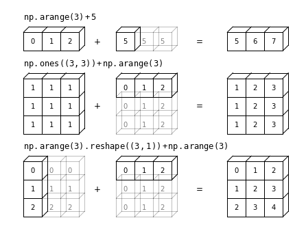
집계 및 그룹화
집계 및 그룹화 장의 그림
분할-적용-결합
import pandas as pd
def draw_dataframe(df, loc=None, width=None, ax=None, linestyle=None,
                   textstyle=None):
    loc = loc or [0, 0]
    width = width or 1

    x, y = loc

    if ax is None:
        ax = plt.gca()

    ncols = len(df.columns) + 1
    nrows = len(df.index) + 1

    dx = dy = width / ncols

    if linestyle is None:
        linestyle = {'color':'black'}

    if textstyle is None:
        textstyle = {'size': 12}

    textstyle.update({'ha':'center', 'va':'center'})

    # draw vertical lines
    for i in range(ncols + 1):
        plt.plot(2 * [x + i * dx], [y, y + dy * nrows], **linestyle)

    # draw horizontal lines
    for i in range(nrows + 1):
        plt.plot([x, x + dx * ncols], 2 * [y + i * dy], **linestyle)

    # Create index labels
    for i in range(nrows - 1):
        plt.text(x + 0.5 * dx, y + (i + 0.5) * dy,
                 str(df.index[::-1][i]), **textstyle)

    # Create column labels
    for i in range(ncols - 1):
        plt.text(x + (i + 1.5) * dx, y + (nrows - 0.5) * dy,
                 str(df.columns[i]), style='italic', **textstyle)

    # Add index label
    if df.index.name:
        plt.text(x + 0.5 * dx, y + (nrows - 0.5) * dy,
                 str(df.index.name), style='italic', **textstyle)

    # Insert data
    for i in range(nrows - 1):
        for j in range(ncols - 1):
            plt.text(x + (j + 1.5) * dx,
                     y + (i + 0.5) * dy,
                     str(df.values[::-1][i, j]), **textstyle)


#----------------------------------------------------------
# Draw figure

df = pd.DataFrame({'data': [1, 2, 3, 4, 5, 6]},
                   index=['A', 'B', 'C', 'A', 'B', 'C'])
df.index.name = 'key'


fig = plt.figure(figsize=(8, 6), facecolor='white')
ax = plt.axes([0, 0, 1, 1])

ax.axis('off')

draw_dataframe(df, [0, 0])

for y, ind in zip([3, 1, -1], 'ABC'):
    split = df[df.index == ind]
    draw_dataframe(split, [2, y])

    sum = pd.DataFrame(split.sum()).T
    sum.index = [ind]
    sum.index.name = 'key'
    sum.columns = ['data']
    draw_dataframe(sum, [4, y + 0.25])

result = df.groupby(df.index).sum()
draw_dataframe(result, [6, 0.75])

style = dict(fontsize=14, ha='center', weight='bold')
plt.text(0.5, 3.6, "Input", **style)
plt.text(2.5, 4.6, "Split", **style)
plt.text(4.5, 4.35, "Apply (sum)", **style)
plt.text(6.5, 2.85, "Combine", **style)

arrowprops = dict(facecolor='black', width=1, headwidth=6)
plt.annotate('', (1.8, 3.6), (1.2, 2.8), arrowprops=arrowprops)
plt.annotate('', (1.8, 1.75), (1.2, 1.75), arrowprops=arrowprops)
plt.annotate('', (1.8, -0.1), (1.2, 0.7), arrowprops=arrowprops)

plt.annotate('', (3.8, 3.8), (3.2, 3.8), arrowprops=arrowprops)
plt.annotate('', (3.8, 1.75), (3.2, 1.75), arrowprops=arrowprops)
plt.annotate('', (3.8, -0.3), (3.2, -0.3), arrowprops=arrowprops)

plt.annotate('', (5.8, 2.8), (5.2, 3.6), arrowprops=arrowprops)
plt.annotate('', (5.8, 1.75), (5.2, 1.75), arrowprops=arrowprops)
plt.annotate('', (5.8, 0.7), (5.2, -0.1), arrowprops=arrowprops)

plt.axis('equal')
plt.ylim(-1.5, 5)
fig.savefig('images/03.08-split-apply-combine.png')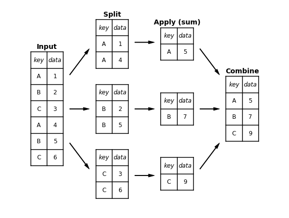
머신러닝이란 무엇인가요?
# common plot formatting for below
def format_plot(ax, title):
    ax.xaxis.set_major_formatter(plt.NullFormatter())
    ax.yaxis.set_major_formatter(plt.NullFormatter())
    ax.set_xlabel('feature 1', color='gray')
    ax.set_ylabel('feature 2', color='gray')
    ax.set_title(title, color='gray')
분류 예시 그림
다음 코드는 분류 섹션에서 그림을 생성합니다.
from sklearn.datasets import make_blobs
from sklearn.svm import SVC

# create 50 separable points
X, y = make_blobs(n_samples=50, centers=2,
                  random_state=0, cluster_std=0.60)

# fit the support vector classifier model
clf = SVC(kernel='linear')
clf.fit(X, y)

# create some new points to predict
X2, _ = make_blobs(n_samples=80, centers=2,
                   random_state=0, cluster_std=0.80)
X2 = X2[50:]

# predict the labels
y2 = clf.predict(X2)
분류 예시 그림 1
# plot the data
fig, ax = plt.subplots(figsize=(8, 6))
point_style = dict(cmap='Paired', s=50)
ax.scatter(X[:, 0], X[:, 1], c=y, **point_style)

# format plot
format_plot(ax, 'Input Data')
ax.axis([-1, 4, -2, 7])

fig.savefig('images/05.01-classification-1.png')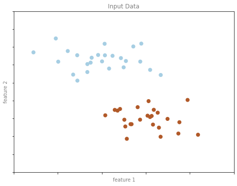
분류 예시 그림 2
# Get contours describing the model
xx = np.linspace(-1, 4, 10)
yy = np.linspace(-2, 7, 10)
xy1, xy2 = np.meshgrid(xx, yy)
Z = np.array([clf.decision_function([t])
              for t in zip(xy1.flat, xy2.flat)]).reshape(xy1.shape)

# plot points and model
fig, ax = plt.subplots(figsize=(8, 6))
line_style = dict(levels = [-1.0, 0.0, 1.0],
                  linestyles = ['dashed', 'solid', 'dashed'],
                  colors = 'gray', linewidths=1)
ax.scatter(X[:, 0], X[:, 1], c=y, **point_style)
ax.contour(xy1, xy2, Z, **line_style)

# format plot
format_plot(ax, 'Model Learned from Input Data')
ax.axis([-1, 4, -2, 7])

fig.savefig('images/05.01-classification-2.png')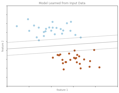
분류 예시 그림 3
# plot the results
fig, ax = plt.subplots(1, 2, figsize=(16, 6))
fig.subplots_adjust(left=0.0625, right=0.95, wspace=0.1)

ax[0].scatter(X2[:, 0], X2[:, 1], c='gray', **point_style)
ax[0].axis([-1, 4, -2, 7])

ax[1].scatter(X2[:, 0], X2[:, 1], c=y2, **point_style)
ax[1].contour(xy1, xy2, Z, **line_style)
ax[1].axis([-1, 4, -2, 7])

format_plot(ax[0], 'Unknown Data')
format_plot(ax[1], 'Predicted Labels')

fig.savefig('images/05.01-classification-3.png')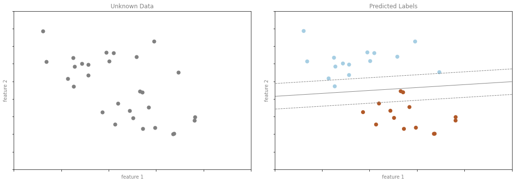
회귀 예제 수치
다음 코드는 회귀 섹션에서 수치를 생성합니다.
from sklearn.linear_model import LinearRegression

# Create some data for the regression
rng = np.random.RandomState(1)

X = rng.randn(200, 2)
y = np.dot(X, [-2, 1]) + 0.1 * rng.randn(X.shape[0])

# fit the regression model
model = LinearRegression()
model.fit(X, y)

# create some new points to predict
X2 = rng.randn(100, 2)

# predict the labels
y2 = model.predict(X2)
회귀 예제 그림 1
# plot data points
fig, ax = plt.subplots()
points = ax.scatter(X[:, 0], X[:, 1], c=y, s=50,
                    cmap='viridis')

# format plot
format_plot(ax, 'Input Data')
ax.axis([-4, 4, -3, 3])

fig.savefig('images/05.01-regression-1.png')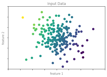
회귀 예제 그림 2
from mpl_toolkits.mplot3d.art3d import Line3DCollection

points = np.hstack([X, y[:, None]]).reshape(-1, 1, 3)
segments = np.hstack([points, points])
segments[:, 0, 2] = -8

# plot points in 3D
fig = plt.figure(figsize=(8, 6))
ax = fig.add_subplot(111, projection='3d')
ax.scatter(X[:, 0], X[:, 1], y, c=y, s=35,
           cmap='viridis')
ax.add_collection3d(Line3DCollection(segments, colors='gray', alpha=0.2))
ax.scatter(X[:, 0], X[:, 1], -8 + np.zeros(X.shape[0]), c=y, s=10,
           cmap='viridis')

# format plot
ax.patch.set_facecolor('white')
ax.view_init(elev=20, azim=-70)
ax.set_zlim3d(-8, 8)
ax.xaxis.set_major_formatter(plt.NullFormatter())
ax.yaxis.set_major_formatter(plt.NullFormatter())
ax.zaxis.set_major_formatter(plt.NullFormatter())
ax.set(xlabel='feature 1', ylabel='feature 2', zlabel='label')

# Hide axes (is there a better way?)
ax.w_xaxis.line.set_visible(False)
ax.w_yaxis.line.set_visible(False)
ax.w_zaxis.line.set_visible(False)
for tick in ax.w_xaxis.get_ticklines():
    tick.set_visible(False)
for tick in ax.w_yaxis.get_ticklines():
    tick.set_visible(False)
for tick in ax.w_zaxis.get_ticklines():
    tick.set_visible(False)
ax.grid(False)

fig.savefig('images/05.01-regression-2.png')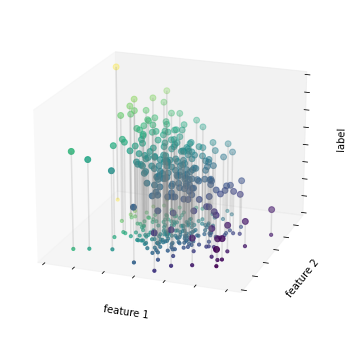
회귀 예제 그림 3
# plot data points
fig, ax = plt.subplots()
pts = ax.scatter(X[:, 0], X[:, 1], c=y, s=50,
                 cmap='viridis', zorder=2)

# compute and plot model color mesh
xx, yy = np.meshgrid(np.linspace(-4, 4),
                     np.linspace(-3, 3))
Xfit = np.vstack([xx.ravel(), yy.ravel()]).T
yfit = model.predict(Xfit)
zz = yfit.reshape(xx.shape)
ax.pcolorfast([-4, 4], [-3, 3], zz, alpha=0.5,
              cmap='viridis', norm=pts.norm, zorder=1)

# format plot
format_plot(ax, 'Input Data with Linear Fit')
ax.axis([-4, 4, -3, 3])

fig.savefig('images/05.01-regression-3.png')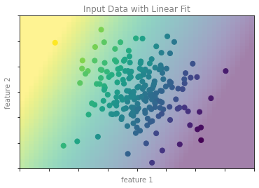
회귀 예제 그림 4
# plot the model fit
fig, ax = plt.subplots(1, 2, figsize=(16, 6))
fig.subplots_adjust(left=0.0625, right=0.95, wspace=0.1)

ax[0].scatter(X2[:, 0], X2[:, 1], c='gray', s=50)
ax[0].axis([-4, 4, -3, 3])

ax[1].scatter(X2[:, 0], X2[:, 1], c=y2, s=50,
              cmap='viridis', norm=pts.norm)
ax[1].axis([-4, 4, -3, 3])

# format plots
format_plot(ax[0], 'Unknown Data')
format_plot(ax[1], 'Predicted Labels')

fig.savefig('images/05.01-regression-4.png')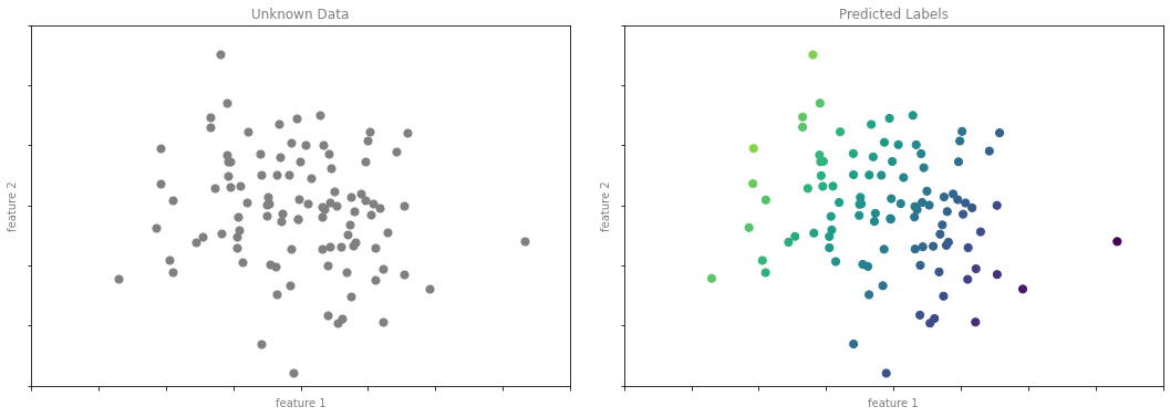
클러스터링 예시 그림
다음 코드는 클러스터링 섹션에서 수치를 생성합니다.
from sklearn.datasets import make_blobs
from sklearn.cluster import KMeans

# create 50 separable points
X, y = make_blobs(n_samples=100, centers=4,
                  random_state=42, cluster_std=1.5)

# Fit the K Means model
model = KMeans(4, random_state=0)
y = model.fit_predict(X)
클러스터링 예 그림 1
# plot the input data
fig, ax = plt.subplots(figsize=(8, 6))
ax.scatter(X[:, 0], X[:, 1], s=50, color='gray')

# format the plot
format_plot(ax, 'Input Data')

fig.savefig('images/05.01-clustering-1.png')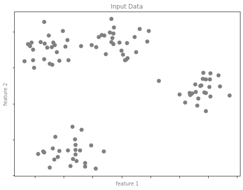
클러스터링 예 그림 2
# plot the data with cluster labels
fig, ax = plt.subplots(figsize=(8, 6))
ax.scatter(X[:, 0], X[:, 1], s=50, c=y, cmap='viridis')

# format the plot
format_plot(ax, 'Learned Cluster Labels')

fig.savefig('images/05.01-clustering-2.png')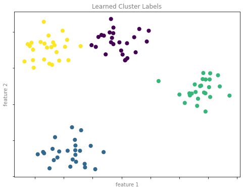
차원 축소 예시 그림
다음 코드는 차원 축소 섹션에서 수치를 생성합니다.
차원 축소 예시 그림 1
from sklearn.datasets import make_swiss_roll

# make data
X, y = make_swiss_roll(200, noise=0.5, random_state=42)
X = X[:, [0, 2]]

# visualize data
fig, ax = plt.subplots()
ax.scatter(X[:, 0], X[:, 1], color='gray', s=30)

# format the plot
format_plot(ax, 'Input Data')

fig.savefig('images/05.01-dimesionality-1.png')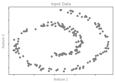
차원 축소 예시 그림 2
from sklearn.manifold import Isomap

model = Isomap(n_neighbors=8, n_components=1)
y_fit = model.fit_transform(X).ravel()

# visualize data
fig, ax = plt.subplots()
pts = ax.scatter(X[:, 0], X[:, 1], c=y_fit, cmap='viridis', s=30)
cb = fig.colorbar(pts, ax=ax)

# format the plot
format_plot(ax, 'Learned Latent Parameter')
cb.set_ticks([])
cb.set_label('Latent Variable', color='gray')

fig.savefig('images/05.01-dimesionality-2.png')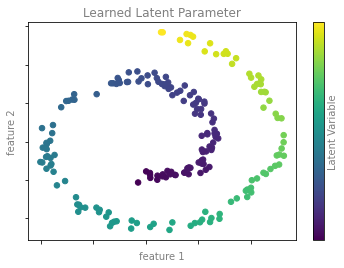
Scikit-Learn 소개
특성 및 레이블 그리드
다음은 특성 행렬과 대상 배열을 보여주는 다이어그램을 생성하는 코드입니다.
fig = plt.figure(figsize=(6, 4))
ax = fig.add_axes([0, 0, 1, 1])
ax.axis('off')
ax.axis('equal')

# Draw features matrix
ax.vlines(range(6), ymin=0, ymax=9, lw=1, color='black')
ax.hlines(range(10), xmin=0, xmax=5, lw=1, color='black')
font_prop = dict(size=12, family='monospace')
ax.text(-1, -1, "Feature Matrix ($X$)", size=14)
ax.text(0.1, -0.3, r'n_features $\longrightarrow$', **font_prop)
ax.text(-0.1, 0.1, r'$\longleftarrow$ n_samples', rotation=90,
        va='top', ha='right', **font_prop)

# Draw labels vector
ax.vlines(range(8, 10), ymin=0, ymax=9, lw=1, color='black')
ax.hlines(range(10), xmin=8, xmax=9, lw=1, color='black')
ax.text(7, -1, "Target Vector ($y$)", size=14)
ax.text(7.9, 0.1, r'$\longleftarrow$ n_samples', rotation=90,
        va='top', ha='right', **font_prop)

ax.set_ylim(10, -2)

fig.savefig('images/05.02-samples-features.png')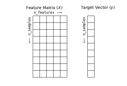
하이퍼파라미터 및 모델 검증
교차 검증 수치
def draw_rects(N, ax, textprop={}):
    for i in range(N):
        ax.add_patch(plt.Rectangle((0, i), 5, 0.7, fc='white', ec='lightgray'))
        ax.add_patch(plt.Rectangle((5. * i / N, i), 5. / N, 0.7, fc='lightgray'))
        ax.text(5. * (i + 0.5) / N, i + 0.35,
                "validation\nset", ha='center', va='center', **textprop)
        ax.text(0, i + 0.35, "trial {0}".format(N - i),
                ha='right', va='center', rotation=90, **textprop)
    ax.set_xlim(-1, 6)
    ax.set_ylim(-0.2, N + 0.2)
2겹 교차 검증
fig = plt.figure()
ax = fig.add_axes([0, 0, 1, 1])
ax.axis('off')
draw_rects(2, ax, textprop=dict(size=14))

fig.savefig('images/05.03-2-fold-CV.png')
5겹 교차 검증
fig = plt.figure(figsize=(8, 5))
ax = fig.add_axes([0, 0, 1, 1])
ax.axis('off')
draw_rects(5, ax, textprop=dict(size=10))

fig.savefig('images/05.03-5-fold-CV.png')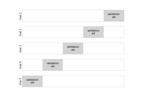
과적합 및 과소적합
import numpy as np

def make_data(N=30, err=0.8, rseed=1):
    # randomly sample the data
    rng = np.random.RandomState(rseed)
    X = rng.rand(N, 1) ** 2
    y = 10 - 1. / (X.ravel() + 0.1)
    if err > 0:
        y += err * rng.randn(N)
    return X, y
from sklearn.preprocessing import PolynomialFeatures
from sklearn.linear_model import LinearRegression
from sklearn.pipeline import make_pipeline
def PolynomialRegression(degree=2, **kwargs):
return make_pipeline(PolynomialFeatures(degree),
LinearRegression(**kwargs))편향-분산 트레이드오프
X, y = make_data()
xfit = np.linspace(-0.1, 1.0, 1000)[:, None]
model1 = PolynomialRegression(1).fit(X, y)
model20 = PolynomialRegression(20).fit(X, y)

fig, ax = plt.subplots(1, 2, figsize=(16, 6))
fig.subplots_adjust(left=0.0625, right=0.95, wspace=0.1)

ax[0].scatter(X.ravel(), y, s=40)
ax[0].plot(xfit.ravel(), model1.predict(xfit), color='gray')
ax[0].axis([-0.1, 1.0, -2, 14])
ax[0].set_title('High-bias model: Underfits the data', size=14)

ax[1].scatter(X.ravel(), y, s=40)
ax[1].plot(xfit.ravel(), model20.predict(xfit), color='gray')
ax[1].axis([-0.1, 1.0, -2, 14])
ax[1].set_title('High-variance model: Overfits the data', size=14)

fig.savefig('images/05.03-bias-variance.png')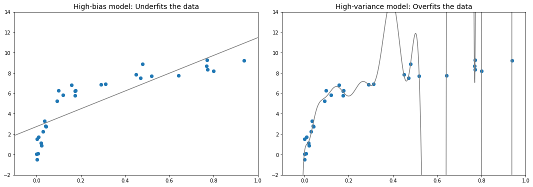
편향-분산 트레이드오프 측정항목
fig, ax = plt.subplots(1, 2, figsize=(16, 6))
fig.subplots_adjust(left=0.0625, right=0.95, wspace=0.1)

X2, y2 = make_data(10, rseed=42)

ax[0].scatter(X.ravel(), y, s=40, c='blue')
ax[0].plot(xfit.ravel(), model1.predict(xfit), color='gray')
ax[0].axis([-0.1, 1.0, -2, 14])
ax[0].set_title('High-bias model: Underfits the data', size=14)
ax[0].scatter(X2.ravel(), y2, s=40, c='red')
ax[0].text(0.02, 0.98, "training score: $R^2$ = {0:.2f}".format(model1.score(X, y)),
           ha='left', va='top', transform=ax[0].transAxes, size=14, color='blue')
ax[0].text(0.02, 0.91, "validation score: $R^2$ = {0:.2f}".format(model1.score(X2, y2)),
           ha='left', va='top', transform=ax[0].transAxes, size=14, color='red')

ax[1].scatter(X.ravel(), y, s=40, c='blue')
ax[1].plot(xfit.ravel(), model20.predict(xfit), color='gray')
ax[1].axis([-0.1, 1.0, -2, 14])
ax[1].set_title('High-variance model: Overfits the data', size=14)
ax[1].scatter(X2.ravel(), y2, s=40, c='red')
ax[1].text(0.02, 0.98, "training score: $R^2$ = {0:.2g}".format(model20.score(X, y)),
           ha='left', va='top', transform=ax[1].transAxes, size=14, color='blue')
ax[1].text(0.02, 0.91, "validation score: $R^2$ = {0:.2g}".format(model20.score(X2, y2)),
           ha='left', va='top', transform=ax[1].transAxes, size=14, color='red')

fig.savefig('images/05.03-bias-variance-2.png')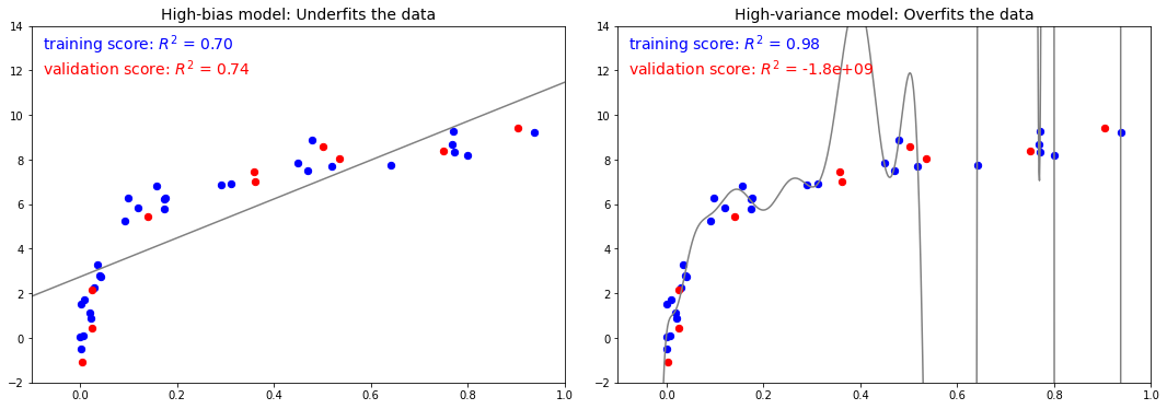
검증 곡선
x = np.linspace(0, 1, 1000)
y1 = -(x - 0.5) ** 2
y2 = y1 - 0.33 + np.exp(x - 1)

fig, ax = plt.subplots(figsize=(8, 6))
ax.plot(x, y2, lw=10, alpha=0.5, color='blue')
ax.plot(x, y1, lw=10, alpha=0.5, color='red')

ax.text(0.15, 0.05, "training score", rotation=45, size=16, color='blue')
ax.text(0.2, -0.05, "validation score", rotation=20, size=16, color='red')

ax.text(0.02, 0.1, r'$\longleftarrow$ High Bias', size=18, rotation=90, va='center')
ax.text(0.98, 0.1, r'$\longleftarrow$ High Variance $\longrightarrow$', size=18, rotation=90, ha='right', va='center')
ax.text(0.48, -0.12, 'Best$\\longrightarrow$\nModel', size=18, rotation=90, va='center')

ax.set_xlim(0, 1)
ax.set_ylim(-0.3, 0.5)

ax.set_xlabel(r'model complexity $\longrightarrow$', size=14)
ax.set_ylabel(r'model score $\longrightarrow$', size=14)

ax.xaxis.set_major_formatter(plt.NullFormatter())
ax.yaxis.set_major_formatter(plt.NullFormatter())

ax.set_title("Validation Curve Schematic", size=16)

fig.savefig('images/05.03-validation-curve.png')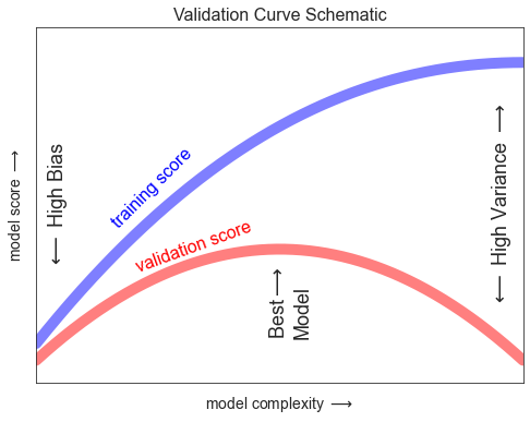
학습 곡선
N = np.linspace(0, 1, 1000)
y1 = 0.75 + 0.2 * np.exp(-4 * N)
y2 = 0.7 - 0.6 * np.exp(-4 * N)

fig, ax = plt.subplots(figsize=(8, 6))
ax.plot(x, y1, lw=10, alpha=0.5, color='blue')
ax.plot(x, y2, lw=10, alpha=0.5, color='red')

ax.text(0.2, 0.83, "training score", rotation=-10, size=16, color='blue')
ax.text(0.2, 0.5, "validation score", rotation=30, size=16, color='red')

ax.text(0.98, 0.45, r'Good Fit $\longrightarrow$', size=18, rotation=90, ha='right', va='center')
ax.text(0.02, 0.57, r'$\longleftarrow$ High Variance $\longrightarrow$', size=18, rotation=90, va='center')

ax.set_xlim(0, 1)
ax.set_ylim(0, 1)

ax.set_xlabel(r'training set size $\longrightarrow$', size=14)
ax.set_ylabel(r'model score $\longrightarrow$', size=14)

ax.xaxis.set_major_formatter(plt.NullFormatter())
ax.yaxis.set_major_formatter(plt.NullFormatter())

ax.set_title("Learning Curve Schematic", size=16)

fig.savefig('images/05.03-learning-curve.png')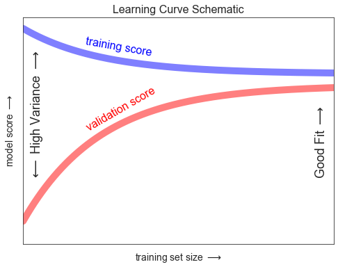
가우스 나이브 베이즈
가우스 나이브 베이즈 예
from sklearn.datasets import make_blobs
X, y = make_blobs(100, 2, centers=2, random_state=2, cluster_std=1.5)

fig, ax = plt.subplots()

ax.scatter(X[:, 0], X[:, 1], c=y, s=50, cmap='RdBu')
ax.set_title('Naive Bayes Model', size=14)

xlim = (-8, 8)
ylim = (-15, 5)

xg = np.linspace(xlim[0], xlim[1], 60)
yg = np.linspace(ylim[0], ylim[1], 40)
xx, yy = np.meshgrid(xg, yg)
Xgrid = np.vstack([xx.ravel(), yy.ravel()]).T

for label, color in enumerate(['red', 'blue']):
    mask = (y == label)
    mu, std = X[mask].mean(0), X[mask].std(0)
    P = np.exp(-0.5 * (Xgrid - mu) ** 2 / std ** 2).prod(1)
    Pm = np.ma.masked_array(P, P < 0.03)
    ax.pcolorfast(xg, yg, Pm.reshape(xx.shape), alpha=0.5,
                  cmap=color.title() + 's')
    ax.contour(xx, yy, P.reshape(xx.shape),
               levels=[0.01, 0.1, 0.5, 0.9],
               colors=color, alpha=0.2)

ax.set(xlim=xlim, ylim=ylim)

fig.savefig('images/05.05-gaussian-NB.png')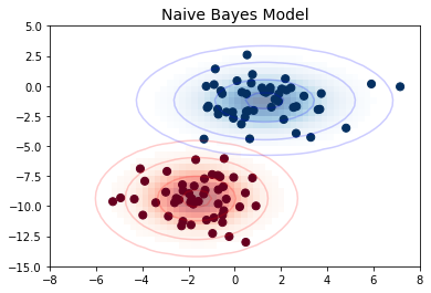
선형 회귀
가우스 기반 함수
from sklearn.linear_model import LinearRegression
from sklearn.base import BaseEstimator, TransformerMixin


class GaussianFeatures(BaseEstimator, TransformerMixin):
    """Uniformly-spaced Gaussian Features for 1D input"""

    def __init__(self, N, width_factor=2.0):
        self.N = N
        self.width_factor = width_factor

    @staticmethod
    def _gauss_basis(x, y, width, axis=None):
        arg = (x - y) / width
        return np.exp(-0.5 * np.sum(arg ** 2, axis))

    def fit(self, X, y=None):
        # create N centers spread along the data range
        self.centers_ = np.linspace(X.min(), X.max(), self.N)
        self.width_ = self.width_factor * (self.centers_[1] - self.centers_[0])
        return self

    def transform(self, X):
        return self._gauss_basis(X[:, :, np.newaxis], self.centers_,
                                 self.width_, axis=1)

rng = np.random.RandomState(1)
x = 10 * rng.rand(50)
y = np.sin(x) + 0.1 * rng.randn(50)
xfit = np.linspace(0, 10, 1000)

gauss_model = make_pipeline(GaussianFeatures(10, 1.0),
                            LinearRegression())
gauss_model.fit(x[:, np.newaxis], y)
yfit = gauss_model.predict(xfit[:, np.newaxis])

gf = gauss_model.named_steps['gaussianfeatures']
lm = gauss_model.named_steps['linearregression']

fig, ax = plt.subplots()

for i in range(10):
    selector = np.zeros(10)
    selector[i] = 1
    Xfit = gf.transform(xfit[:, None]) * selector
    yfit = lm.predict(Xfit)
    ax.fill_between(xfit, yfit.min(), yfit, color='gray', alpha=0.2)

ax.scatter(x, y)
ax.plot(xfit, gauss_model.predict(xfit[:, np.newaxis]))
ax.set_xlim(0, 10)
ax.set_ylim(yfit.min(), 1.5)

fig.savefig('images/05.06-gaussian-basis.png')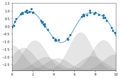
랜덤 포레스트
도우미 코드
다음은 심층: 의사결정 트리 및 랜덤 포레스트에서 사용되는 일부 도구를 포함하는 helpers_05_08.py 모듈을 생성합니다.
import numpy as np
import matplotlib.pyplot as plt
from sklearn.tree import DecisionTreeClassifier
from ipywidgets import interact
%%file helpers_05_08.py


def visualize_tree(estimator, X, y, boundaries=True,
                   xlim=None, ylim=None, ax=None):
    ax = ax or plt.gca()

    # Plot the training points
    ax.scatter(X[:, 0], X[:, 1], c=y, s=30, cmap='viridis',
               clim=(y.min(), y.max()), zorder=3)
    ax.axis('tight')
    ax.axis('off')
    if xlim is None:
        xlim = ax.get_xlim()
    if ylim is None:
        ylim = ax.get_ylim()

    # fit the estimator
    estimator.fit(X, y)
    xx, yy = np.meshgrid(np.linspace(*xlim, num=200),
                         np.linspace(*ylim, num=200))
    Z = estimator.predict(np.c_[xx.ravel(), yy.ravel()])

    # Put the result into a color plot
    n_classes = len(np.unique(y))
    Z = Z.reshape(xx.shape)
    contours = ax.contourf(xx, yy, Z, alpha=0.3,
                           levels=np.arange(n_classes + 1) - 0.5,
                           cmap='viridis', zorder=1)

    ax.set(xlim=xlim, ylim=ylim)

    # Plot the decision boundaries
    def plot_boundaries(i, xlim, ylim):
        if i >= 0:
            tree = estimator.tree_

            if tree.feature[i] == 0:
                ax.plot([tree.threshold[i], tree.threshold[i]], ylim, '-k', zorder=2)
                plot_boundaries(tree.children_left[i],
                                [xlim[0], tree.threshold[i]], ylim)
                plot_boundaries(tree.children_right[i],
                                [tree.threshold[i], xlim[1]], ylim)

            elif tree.feature[i] == 1:
                ax.plot(xlim, [tree.threshold[i], tree.threshold[i]], '-k', zorder=2)
                plot_boundaries(tree.children_left[i], xlim,
                                [ylim[0], tree.threshold[i]])
                plot_boundaries(tree.children_right[i], xlim,
                                [tree.threshold[i], ylim[1]])

    if boundaries:
        plot_boundaries(0, xlim, ylim)


def plot_tree_interactive(X, y):
    def interactive_tree(depth=5):
        clf = DecisionTreeClassifier(max_depth=depth, random_state=0)
        visualize_tree(clf, X, y)

    return interact(interactive_tree, depth=(1, 5))


def randomized_tree_interactive(X, y):
    N = int(0.75 * X.shape[0])

    xlim = (X[:, 0].min(), X[:, 0].max())
    ylim = (X[:, 1].min(), X[:, 1].max())

    def fit_randomized_tree(random_state=0):
        clf = DecisionTreeClassifier(max_depth=15)
        i = np.arange(len(y))
        rng = np.random.RandomState(random_state)
        rng.shuffle(i)
        visualize_tree(clf, X[i[:N]], y[i[:N]], boundaries=False,
                       xlim=xlim, ylim=ylim)

    interact(fit_randomized_tree, random_state=(0, 100))
Overwriting helpers_05_08.py의사결정 트리의 예
fig = plt.figure(figsize=(10, 4))
ax = fig.add_axes([0, 0, 0.8, 1], frameon=False, xticks=[], yticks=[])
ax.set_title('Example Decision Tree: Animal Classification', size=24)

def text(ax, x, y, t, size=20, **kwargs):
    ax.text(x, y, t,
            ha='center', va='center', size=size,
            bbox=dict(boxstyle='round', ec='k', fc='w'), **kwargs)

text(ax, 0.5, 0.9, "How big is\nthe animal?", 20)
text(ax, 0.3, 0.6, "Does the animal\nhave horns?", 18)
text(ax, 0.7, 0.6, "Does the animal\nhave two legs?", 18)
text(ax, 0.12, 0.3, "Are the horns\nlonger than 10cm?", 14)
text(ax, 0.38, 0.3, "Is the animal\nwearing a collar?", 14)
text(ax, 0.62, 0.3, "Does the animal\nhave wings?", 14)
text(ax, 0.88, 0.3, "Does the animal\nhave a tail?", 14)

text(ax, 0.4, 0.75, "> 1m", 12, alpha=0.6)
text(ax, 0.6, 0.75, "< 1m", 12, alpha=0.6)

text(ax, 0.21, 0.45, "yes", 12, alpha=0.6)
text(ax, 0.34, 0.45, "no", 12, alpha=0.6)

text(ax, 0.66, 0.45, "yes", 12, alpha=0.6)
text(ax, 0.79, 0.45, "no", 12, alpha=0.6)

ax.plot([0.3, 0.5, 0.7], [0.6, 0.9, 0.6], '-k')
ax.plot([0.12, 0.3, 0.38], [0.3, 0.6, 0.3], '-k')
ax.plot([0.62, 0.7, 0.88], [0.3, 0.6, 0.3], '-k')
ax.plot([0.0, 0.12, 0.20], [0.0, 0.3, 0.0], '--k')
ax.plot([0.28, 0.38, 0.48], [0.0, 0.3, 0.0], '--k')
ax.plot([0.52, 0.62, 0.72], [0.0, 0.3, 0.0], '--k')
ax.plot([0.8, 0.88, 1.0], [0.0, 0.3, 0.0], '--k')
ax.axis([0, 1, 0, 1])

fig.savefig('images/05.08-decision-tree.png')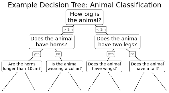
의사결정 트리 수준
from helpers_05_08 import visualize_tree
from sklearn.tree import DecisionTreeClassifier
from sklearn.datasets import make_blobs


fig, ax = plt.subplots(1, 4, figsize=(16, 3))
fig.subplots_adjust(left=0.02, right=0.98, wspace=0.1)

X, y = make_blobs(n_samples=300, centers=4,
                  random_state=0, cluster_std=1.0)

for axi, depth in zip(ax, range(1, 5)):
    model = DecisionTreeClassifier(max_depth=depth)
    visualize_tree(model, X, y, ax=axi)
    axi.set_title('depth = {0}'.format(depth))

fig.savefig('images/05.08-decision-tree-levels.png')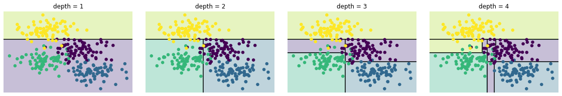
의사결정 트리 과적합
model = DecisionTreeClassifier()

fig, ax = plt.subplots(1, 2, figsize=(16, 6))
fig.subplots_adjust(left=0.0625, right=0.95, wspace=0.1)
visualize_tree(model, X[::2], y[::2], boundaries=False, ax=ax[0])
visualize_tree(model, X[1::2], y[1::2], boundaries=False, ax=ax[1])

fig.savefig('images/05.08-decision-tree-overfitting.png')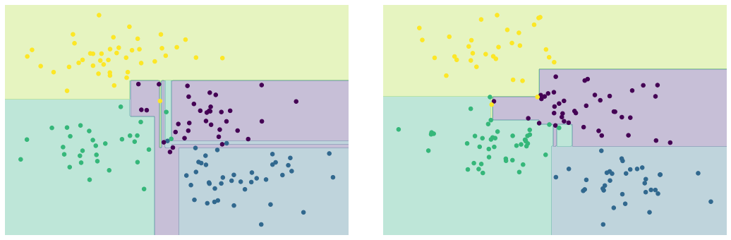
주성분 분석
주성분 회전
from sklearn.decomposition import PCAdef draw_vector(v0, v1, ax=None):
ax = ax or plt.gca()
arrowprops=dict(arrowstyle='->',
linewidth=2,
shrinkA=0, shrinkB=0)
ax.annotate('', v1, v0, arrowprops=arrowprops)rng = np.random.RandomState(1)
X = np.dot(rng.rand(2, 2), rng.randn(2, 200)).T
pca = PCA(n_components=2, whiten=True)
pca.fit(X)
fig, ax = plt.subplots(1, 2, figsize=(16, 6))
fig.subplots_adjust(left=0.0625, right=0.95, wspace=0.1)
# plot data
ax[0].scatter(X[:, 0], X[:, 1], alpha=0.2)
for length, vector in zip(pca.explained_variance_, pca.components_):
v = vector * 3 * np.sqrt(length)
draw_vector(pca.mean_, pca.mean_ + v, ax=ax[0])
ax[0].axis('equal')
ax[0].set(xlabel='x', ylabel='y', title='input')
# plot principal components
X_pca = pca.transform(X)
ax[1].scatter(X_pca[:, 0], X_pca[:, 1], alpha=0.2)
draw_vector([0, 0], [0, 3], ax=ax[1])
draw_vector([0, 0], [3, 0], ax=ax[1])
ax[1].axis('equal')
ax[1].set(xlabel='component 1', ylabel='component 2',
title='principal components',
xlim=(-5, 5), ylim=(-3, 3.1))
fig.savefig('images/05.09-PCA-rotation.png')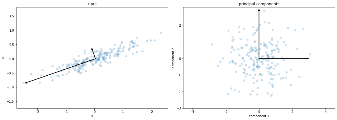
숫자 픽셀 구성 요소
def plot_pca_components(x, coefficients=None, mean=0, components=None,
                        imshape=(8, 8), n_components=8, fontsize=12,
                        show_mean=True):
    if coefficients is None:
        coefficients = x

    if components is None:
        components = np.eye(len(coefficients), len(x))

    mean = np.zeros_like(x) + mean


    fig = plt.figure(figsize=(1.2 * (5 + n_components), 1.2 * 2))
    g = plt.GridSpec(2, 4 + bool(show_mean) + n_components, hspace=0.3)

    def show(i, j, x, title=None):
        ax = fig.add_subplot(g[i, j], xticks=[], yticks=[])
        ax.imshow(x.reshape(imshape), interpolation='nearest', cmap='binary')
        if title:
            ax.set_title(title, fontsize=fontsize)

    show(slice(2), slice(2), x, "True")

    approx = mean.copy()

    counter = 2
    if show_mean:
        show(0, 2, np.zeros_like(x) + mean, r'$\mu$')
        show(1, 2, approx, r'$1 \cdot \mu$')
        counter += 1

    for i in range(n_components):
        approx = approx + coefficients[i] * components[i]
        show(0, i + counter, components[i], r'$c_{0}$'.format(i + 1))
        show(1, i + counter, approx,
             r"${0:.2f} \cdot c_{1}$".format(coefficients[i], i + 1))
        if show_mean or i > 0:
            plt.gca().text(0, 1.05, '$+$', ha='right', va='bottom',
                           transform=plt.gca().transAxes, fontsize=fontsize)

    show(slice(2), slice(-2, None), approx, "Approx")
    return fig
from sklearn.datasets import load_digits
digits = load_digits()
sns.set_style('white')
fig = plot_pca_components(digits.data[10],
show_mean=False)
fig.savefig('images/05.09-digits-pixel-components.png')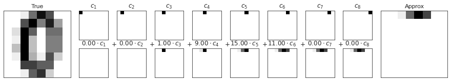
숫자 PCA 구성 요소
pca = PCA(n_components=8)
Xproj = pca.fit_transform(digits.data)
sns.set_style('white')
fig = plot_pca_components(digits.data[10], Xproj[10],
                          pca.mean_, pca.components_)

fig.savefig('images/05.09-digits-pca-components.png')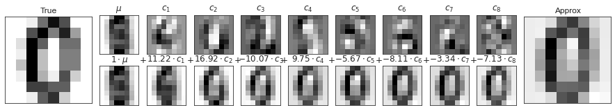
다양한 학습
LLE 대 MDS 연계
from matplotlib.image import imread
def make_hello(N=1000, rseed=42):
    # Make a plot with "HELLO" text; save as png
    fig, ax = plt.subplots(figsize=(4, 1))
    fig.subplots_adjust(left=0, right=1, bottom=0, top=1)
    ax.axis('off')
    ax.text(0.5, 0.4, 'HELLO', va='center', ha='center', weight='bold', size=85)
    fig.savefig('hello.png')
    plt.close(fig)

    # Open this PNG and draw random points from it
    data = imread('hello.png')[::-1, :, 0].T
    rng = np.random.RandomState(rseed)
    X = rng.rand(4 * N, 2)
    i, j = (X * data.shape).astype(int).T
    mask = (data[i, j] < 1)
    X = X[mask]
    X[:, 0] *= (data.shape[0] / data.shape[1])
    X = X[:N]
    return X[np.argsort(X[:, 0])]
def make_hello_s_curve(X):
t = (X[:, 0] - 2) * 0.75 * np.pi
x = np.sin(t)
y = X[:, 1]
z = np.sign(t) * (np.cos(t) - 1)
return np.vstack((x, y, z)).T
X = make_hello(1000)
XS = make_hello_s_curve(X)
colorize = dict(c=X[:, 0], cmap=plt.cm.get_cmap('rainbow', 5))from mpl_toolkits.mplot3d.art3d import Line3DCollection
from sklearn.neighbors import NearestNeighbors
# construct lines for MDS
rng = np.random.RandomState(42)
ind = rng.permutation(len(X))
lines_MDS = [(XS[i], XS[j]) for i in ind[:100] for j in ind[100:200]]
# construct lines for LLE
nbrs = NearestNeighbors(n_neighbors=100).fit(XS).kneighbors(XS[ind[:100]])[1]
lines_LLE = [(XS[ind[i]], XS[j]) for i in range(100) for j in nbrs[i]]
titles = ['MDS Linkages', 'LLE Linkages (100 NN)']
# plot the results
fig, ax = plt.subplots(1, 2, figsize=(16, 6),
subplot_kw=dict(projection='3d'))
fig.subplots_adjust(left=0, right=1, bottom=0, top=1, hspace=0, wspace=0)
for axi, title, lines in zip(ax, titles, [lines_MDS, lines_LLE]):
axi.scatter3D(XS[:, 0], XS[:, 1], XS[:, 2], **colorize)
axi.add_collection(Line3DCollection(lines, lw=1, color='black',
alpha=0.05))
axi.view_init(elev=10, azim=-80)
axi.set_title(title, size=18)
fig.savefig('images/05.10-LLE-vs-MDS.png')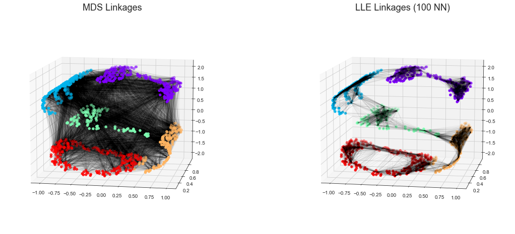
K-평균
기대치 극대화
다음 그림은 K 평균에 대한 기대치 최대화 접근 방식을 시각적으로 보여줍니다.
from sklearn.datasets import make_blobs
from sklearn.metrics import pairwise_distances_argmin

X, y_true = make_blobs(n_samples=300, centers=4,
                       cluster_std=0.60, random_state=0)

rng = np.random.RandomState(42)
centers = [0, 4] + rng.randn(4, 2)

def draw_points(ax, c, factor=1):
    ax.scatter(X[:, 0], X[:, 1], c=c, cmap='viridis',
               s=50 * factor, alpha=0.3)

def draw_centers(ax, centers, factor=1, alpha=1.0):
    ax.scatter(centers[:, 0], centers[:, 1],
               c=np.arange(4), cmap='viridis', s=200 * factor,
               alpha=alpha)
    ax.scatter(centers[:, 0], centers[:, 1],
               c='black', s=50 * factor, alpha=alpha)

def make_ax(fig, gs):
    ax = fig.add_subplot(gs)
    ax.xaxis.set_major_formatter(plt.NullFormatter())
    ax.yaxis.set_major_formatter(plt.NullFormatter())
    return ax

fig = plt.figure(figsize=(15, 4))
gs = plt.GridSpec(4, 15, left=0.02, right=0.98, bottom=0.05, top=0.95, wspace=0.2, hspace=0.2)
ax0 = make_ax(fig, gs[:4, :4])
ax0.text(0.98, 0.98, "Random Initialization", transform=ax0.transAxes,
         ha='right', va='top', size=16)
draw_points(ax0, 'gray', factor=2)
draw_centers(ax0, centers, factor=2)

for i in range(3):
    ax1 = make_ax(fig, gs[:2, 4 + 2 * i:6 + 2 * i])
    ax2 = make_ax(fig, gs[2:, 5 + 2 * i:7 + 2 * i])

    # E-step
    y_pred = pairwise_distances_argmin(X, centers)
    draw_points(ax1, y_pred)
    draw_centers(ax1, centers)

    # M-step
    new_centers = np.array([X[y_pred == i].mean(0) for i in range(4)])
    draw_points(ax2, y_pred)
    draw_centers(ax2, centers, alpha=0.3)
    draw_centers(ax2, new_centers)
    for i in range(4):
        ax2.annotate('', new_centers[i], centers[i],
                     arrowprops=dict(arrowstyle='->', linewidth=1))


    # Finish iteration
    centers = new_centers
    ax1.text(0.95, 0.95, "E-Step", transform=ax1.transAxes, ha='right', va='top', size=14)
    ax2.text(0.95, 0.95, "M-Step", transform=ax2.transAxes, ha='right', va='top', size=14)


# Final E-step
y_pred = pairwise_distances_argmin(X, centers)
axf = make_ax(fig, gs[:4, -4:])
draw_points(axf, y_pred, factor=2)
draw_centers(axf, centers, factor=2)
axf.text(0.98, 0.98, "Final Clustering", transform=axf.transAxes,
         ha='right', va='top', size=16)


fig.savefig('images/05.11-expectation-maximization.png')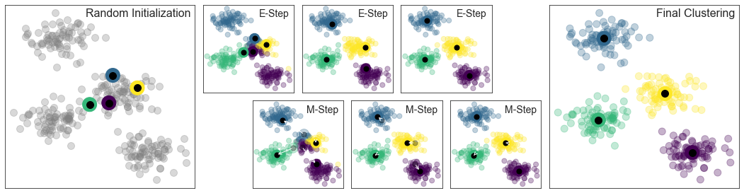
대화형 K-평균
다음 스크립트는 IPython의 대화형 위젯을 사용하여 K-평균 알고리즘을 대화형으로 보여줍니다. IPython 노트북 내에서 이를 실행하여 K 평균 계산을 위한 기대치 최대화 알고리즘을 살펴보세요.
import matplotlib.pyplot as plt
import numpy as np
from ipywidgets import interact
from sklearn.metrics import pairwise_distances_argmin
from sklearn.datasets import make_blobs
%matplotlib inline


def plot_kmeans_interactive(min_clusters=1, max_clusters=6):
    X, y = make_blobs(n_samples=300, centers=4,
                      random_state=0, cluster_std=0.60)

    def plot_points(X, labels, n_clusters):
        plt.scatter(X[:, 0], X[:, 1], c=labels, s=50, cmap='viridis',
                    vmin=0, vmax=n_clusters - 1)
    def plot_centers(centers):
        plt.scatter(centers[:, 0], centers[:, 1], marker='o',
                    c=np.arange(centers.shape[0]),
                    s=200, cmap='viridis')
        plt.scatter(centers[:, 0], centers[:, 1], marker='o',
                    c='black', s=50)


    def _kmeans_step(frame=0, n_clusters=4):
        rng = np.random.RandomState(2)
        labels = np.zeros(X.shape[0])
        centers = rng.randn(n_clusters, 2)

        nsteps = frame // 3

        for i in range(nsteps + 1):
            old_centers = centers
            if i < nsteps or frame % 3 > 0:
                labels = pairwise_distances_argmin(X, centers)

            if i < nsteps or frame % 3 > 1:
                centers = np.array([X[labels == j].mean(0)
                                    for j in range(n_clusters)])
                nans = np.isnan(centers)
                centers[nans] = old_centers[nans]

        # plot the data and cluster centers
        plot_points(X, labels, n_clusters)
        plot_centers(old_centers)

        # plot new centers if third frame
        if frame % 3 == 2:
            for i in range(n_clusters):
                plt.annotate('', centers[i], old_centers[i],
                             arrowprops=dict(arrowstyle='->', linewidth=1))
            plot_centers(centers)

        plt.xlim(-4, 4)
        plt.ylim(-2, 10)

        if frame % 3 == 1:
            plt.text(3.8, 9.5, "1. Reassign points to nearest centroid",
                     ha='right', va='top', size=14)
        elif frame % 3 == 2:
            plt.text(3.8, 9.5, "2. Update centroids to cluster means",
                     ha='right', va='top', size=14)

    return interact(_kmeans_step, frame=(0, 50),
                    n_clusters=[min_clusters, max_clusters])

plot_kmeans_interactive()
가우스 혼합 모델
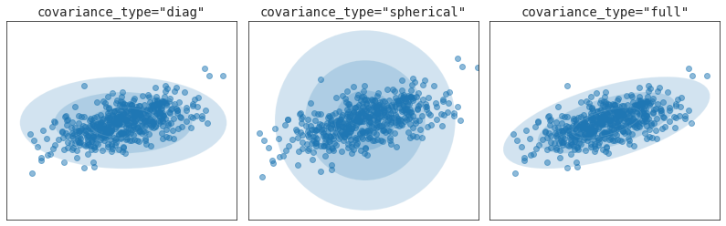
공분산 유형
from sklearn.mixture import GaussianMixture
from matplotlib.patches import Ellipse


def draw_ellipse(position, covariance, ax=None, **kwargs):
    """Draw an ellipse with a given position and covariance"""
    ax = ax or plt.gca()

    # Convert covariance to principal axes
    if covariance.shape == (2, 2):
        U, s, Vt = np.linalg.svd(covariance)
        angle = np.degrees(np.arctan2(U[1, 0], U[0, 0]))
        width, height = 2 * np.sqrt(s)
    elif covariance.shape == (2,):
        angle = 0
        width, height = 2 * np.sqrt(covariance)
    else:
        angle = 0
        width = height = 2 * np.sqrt(covariance)

    # Draw the Ellipse
    for nsig in range(1, 4):
        ax.add_patch(Ellipse(position, nsig * width, nsig * height,
                             angle, **kwargs))

fig, ax = plt.subplots(1, 3, figsize=(14, 4))
fig.subplots_adjust(wspace=0.05)

rng = np.random.RandomState(5)
X = np.dot(rng.randn(500, 2), rng.randn(2, 2))

for i, cov_type in enumerate(['diag', 'spherical', 'full']):
    model = GaussianMixture(1, covariance_type=cov_type).fit(X)
    ax[i].axis('equal')
    ax[i].scatter(X[:, 0], X[:, 1], alpha=0.5)
    ax[i].set_xlim(-3, 3)
    ax[i].set_title('covariance_type="{0}"'.format(cov_type),
                    size=14, family='monospace')

    draw_ellipse(model.means_[0], model.covariances_[0], ax[i], alpha=0.2)
    ax[i].xaxis.set_major_formatter(plt.NullFormatter())
    ax[i].yaxis.set_major_formatter(plt.NullFormatter())

fig.savefig('images/05.12-covariance-type.png')