import matplotlib.pyplot as plt
plt.style.use('seaborn-whitegrid')플롯 범례 사용자 정의
플롯 범례는 시각화에 의미를 부여하여 다양한 플롯 요소에 의미를 할당합니다. 우리는 이전에 간단한 범례를 만드는 방법을 살펴보았습니다. 여기서는 Matplotlib에서 범례의 배치와 미학을 사용자 정의하는 방법을 살펴보겠습니다.
가장 간단한 범례는 ‘plt.legend’ 명령을 사용하여 생성합니다. 이 명령은 레이블이 지정된 플롯 요소에 대한 범례를 자동으로 생성합니다(다음 그림 참조).
import numpy as np
%matplotlib inline
x = np.linspace(0, 10, 1000)
fig, ax = plt.subplots()
ax.plot(x, np.sin(x), '-b', label='Sine')
ax.plot(x, np.cos(x), '--r', label='Cosine')
ax.axis('equal')
leg = ax.legend()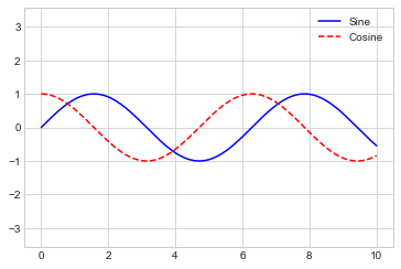
그러나 그러한 범례를 사용자 정의할 수 있는 방법은 여러 가지가 있습니다. 예를 들어 위치를 지정하고 프레임을 켤 수 있습니다(다음 그림 참조).
ax.legend(loc='upper left', frameon=True)
fig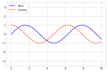
다음 그림과 같이 ncol 명령을 사용하여 범례의 열 수를 지정합니다.
ax.legend(loc='lower center', ncol=2)
fig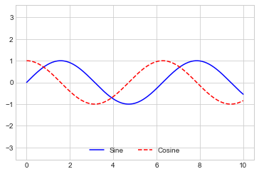
그리고 둥근 상자(fancybox)를 사용하거나, 그림자를 추가하거나, 프레임의 투명도(알파 값)를 변경하거나, 텍스트 주위의 패딩을 변경합니다(다음 그림 참조).
ax.legend(frameon=True, fancybox=True, framealpha=1,
          shadow=True, borderpad=1)
fig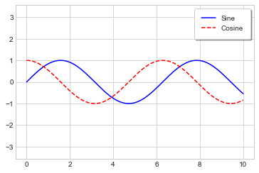
사용 가능한 범례 옵션에 대한 자세한 내용은 plt.legend 독스트링을 참조하세요.
범례에 대한 요소 선택
이미 살펴본 것처럼 범례에는 플롯의 레이블이 지정된 모든 요소가 포함됩니다. 이것이 원하지 않는 경우 plot 명령으로 반환된 개체를 사용하여 범례에 표시되는 요소와 레이블을 미세 조정합니다. plt.plot은 한 번에 여러 라인을 생성할 수 있으며 생성된 라인 인스턴스 목록을 반환합니다. 이들 중 하나를 plt.legend에 전달하면 지정하려는 레이블과 함께 식별할 레이블을 알려줍니다(다음 그림 참조).
y = np.sin(x[:, np.newaxis] + np.pi * np.arange(0, 2, 0.5))
lines = plt.plot(x, y)

# lines is a list of plt.Line2D instances
plt.legend(lines[:2], ['first', 'second'], frameon=True);
일반적으로 실제로 범례에 표시하려는 플롯 요소에 레이블을 적용하는 첫 번째 방법을 사용하는 것이 더 명확하다는 것을 알았습니다(다음 그림 참조).
plt.plot(x, y[:, 0], label='first')
plt.plot(x, y[:, 1], label='second')
plt.plot(x, y[:, 2:])
plt.legend(frameon=True);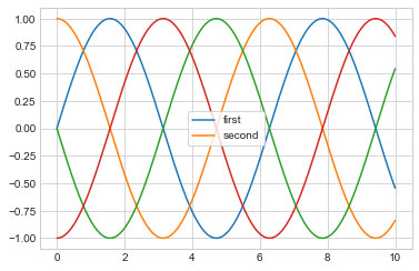
범례는 label 속성이 설정되지 않은 모든 요소를 무시합니다.
포인트 크기에 대한 범례
때로는 범례 기본값이 주어진 시각화에 충분하지 않은 경우가 있습니다. 예를 들어 데이터의 특정 특징을 표시하기 위해 점 크기를 사용하고 이를 반영하는 범례를 만들고 싶을 수 있습니다. 다음은 캘리포니아 도시의 인구를 나타내기 위해 포인트 크기를 사용하는 예입니다. 우리는 점 크기의 척도를 지정하는 범례를 원하며 항목 없이 일부 레이블이 지정된 데이터를 플롯하여 이를 수행합니다(다음 그림 참조).
# Uncomment to download the data
# url = ('https://raw.githubusercontent.com/jakevdp/PythonDataScienceHandbook/'
#        'master/notebooks/data/california_cities.csv')
# !cd data && curl -O {url}
import pandas as pd
cities = pd.read_csv('data/california_cities.csv')
# Extract the data we're interested in
lat, lon = cities['latd'], cities['longd']
population, area = cities['population_total'], cities['area_total_km2']
# Scatter the points, using size and color but no label
plt.scatter(lon, lat, label=None,
c=np.log10(population), cmap='viridis',
s=area, linewidth=0, alpha=0.5)
plt.axis('equal')
plt.xlabel('longitude')
plt.ylabel('latitude')
plt.colorbar(label='log$_{10}$(population)')
plt.clim(3, 7)
# Here we create a legend:
# we'll plot empty lists with the desired size and label
for area in [100, 300, 500]:
plt.scatter([], [], c='k', alpha=0.3, s=area,
label=str(area) + ' km$^2$')
plt.legend(scatterpoints=1, frameon=False, labelspacing=1, title='City Area')
plt.title('California Cities: Area and Population');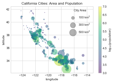
범례는 항상 플롯에 있는 일부 개체를 참조하므로 특정 모양을 표시하려면 해당 모양을 플롯해야 합니다. 이 경우 우리가 원하는 객체(회색 원)가 플롯에 없으므로 빈 목록을 플롯하여 가짜로 만듭니다. 범례에는 지정된 레이블이 있는 플롯 요소만 나열된다는 점을 기억하세요.
빈 목록을 플로팅하여 범례에 의해 선택되는 레이블이 있는 플롯 객체를 생성하고 이제 범례가 몇 가지 유용한 정보를 알려줍니다. 이 전략은 보다 정교한 시각화를 만드는 데 유용합니다.
여러 범례
플롯을 디자인할 때 동일한 축에 여러 범례를 추가하고 싶을 때가 있습니다. 안타깝게도 Matplotlib에서는 이를 쉽게 수행할 수 없습니다. 표준 legend 인터페이스를 통해서는 전체 플롯에 대한 단일 범례만 생성합니다. plt.legend 또는 ax.legend를 사용하여 두 번째 범례를 만들려고 하면 단순히 첫 번째 범례를 덮어쓰게 됩니다. We can work around this by creating a new legend artist from scratch (Artist is the base class Matplotlib uses for visual attributes), and then using the lower-level ax.add_artist method to manually add the second artist to the plot (see the following figure):
from matplotlib.legend import Legend
fig, ax = plt.subplots()

lines = []
styles = ['-', '--', '-.', ':']
x = np.linspace(0, 10, 1000)

for i in range(4):
    lines += ax.plot(x, np.sin(x - i * np.pi / 2),
                     styles[i], color='black')
ax.axis('equal')

# Specify the lines and labels of the first legend
ax.legend(lines[:2], ['line A', 'line B'], loc='upper right')

# Create the second legend and add the artist manually
leg = Legend(ax, lines[2:], ['line C', 'line D'], loc='lower right')
ax.add_artist(leg);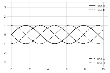
이는 Matplotlib 플롯을 구성하는 하위 수준 아티스트 개체를 엿볼 수 있는 것입니다. ax.legend의 소스 코드를 검토하면(Jupyter 노트북 내에서 ax.legend??를 사용하여 이 작업을 수행할 수 있음을 기억하세요) 이 함수는 적절한 Legend 아티스트를 생성하기 위한 몇 가지 로직으로만 구성되어 있다는 것을 확인합니다. 그런 다음 이 아티스트는 legend_ 속성에 저장되고 플롯이 그려질 때 그림에 추가됩니다.