import warnings
warnings.filterwarnings('ignore')

import numpy as np
import pandas as pd
PREVIOUS_MAX_ROWS = pd.options.display.max_rows
pd.options.display.max_rows = 20
pd.options.display.max_colwidth = 80
pd.options.display.max_columns = 20
np.random.seed(12345)
import matplotlib.pyplot as plt
import matplotlib
plt.rc("figure", figsize=(10, 6))
np.set_printoptions(precision=4, suppress=True)
import matplotlib.pyplot as plt
# Matplotlib 한글 폰트 설정 (macOS용)
plt.rc('font', family='AppleGothic')
plt.rc('axes', unicode_minus=False)8 9장: 그래프와 시각화
데이터 속에 숨겨진 인사이트를 발견하기 위한 시각화 기술을 습득합니다.
import matplotlib.pyplot as plt8.1 matplotlib API 기초
Figure, Subplot 등 기본적인 그래프 구조를 생성하고 꾸미는 방법을 알아봅니다.
8.2 matplotlib API 기초
기본적인 그래프 생성 로직과 서브플롯 구성을 이해합니다.
data = np.arange(10)
data
plt.plot(data)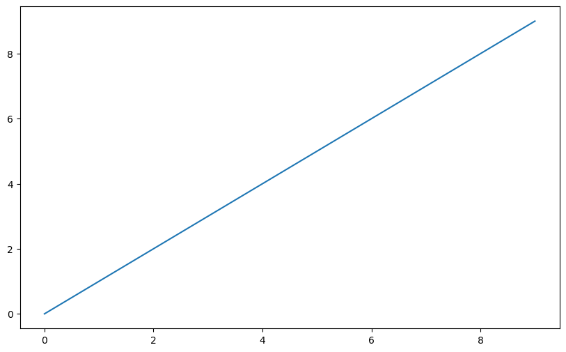
fig = plt.figure()<Figure size 1000x600 with 0 Axes>ax1 = fig.add_subplot(2, 2, 1)ax2 = fig.add_subplot(2, 2, 2)
ax3 = fig.add_subplot(2, 2, 3)ax3.plot(np.random.standard_normal(50).cumsum(), color="black",
linestyle="dashed")ax1.hist(np.random.standard_normal(100), bins=20, color="black", alpha=0.3);
ax2.scatter(np.arange(30), np.arange(30) + 3 * np.random.standard_normal(30));plt.close("all")fig, axes = plt.subplots(2, 3)
axesarray([[<Axes: >, <Axes: >, <Axes: >],
[<Axes: >, <Axes: >, <Axes: >]], dtype=object)
fig, axes = plt.subplots(2, 2, sharex=True, sharey=True)
for i in range(2):
    for j in range(2):
        axes[i, j].hist(np.random.standard_normal(500), bins=50,
                        color="black", alpha=0.5)
fig.subplots_adjust(wspace=0, hspace=0)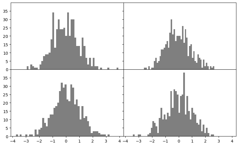
fig = plt.figure()<Figure size 1000x600 with 0 Axes>ax = fig.add_subplot()
ax.plot(np.random.standard_normal(30).cumsum(), color="black",
linestyle="dashed", marker="o");plt.close("all")fig = plt.figure()
ax = fig.add_subplot()
data = np.random.standard_normal(30).cumsum()
ax.plot(data, color="black", linestyle="dashed", label="Default");
ax.plot(data, color="black", linestyle="dashed",
drawstyle="steps-post", label="steps-post");
ax.legend()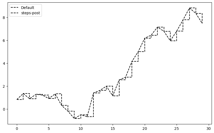
fig, ax = plt.subplots()
ax.plot(np.random.standard_normal(1000).cumsum());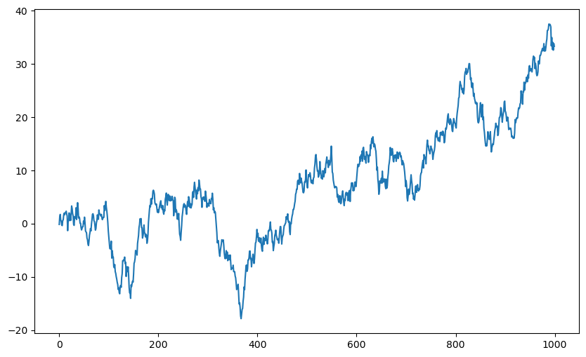
8.3 주석과 꾸미기
축 이름, 제목, 주석 등을 추가하여 그래프의 전달력을 높입니다.
ticks = ax.set_xticks([0, 250, 500, 750, 1000])
labels = ax.set_xticklabels(["one", "two", "three", "four", "five"],
rotation=30, fontsize=8)ax.set_xlabel("Stages")
ax.set_title("My first matplotlib plot")Text(0.5, 1.0, 'My first matplotlib plot')fig, ax = plt.subplots()
ax.plot(np.random.randn(1000).cumsum(), color="black", label="one");
ax.plot(np.random.randn(1000).cumsum(), color="black", linestyle="dashed",
label="two");
ax.plot(np.random.randn(1000).cumsum(), color="black", linestyle="dotted",
label="three");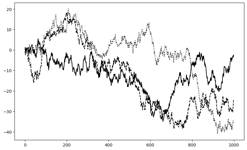
ax.legend()from datetime import datetime
fig, ax = plt.subplots()
data = pd.read_csv("examples/spx.csv", index_col=0, parse_dates=True)
spx = data["SPX"]
spx.plot(ax=ax, color="black")
crisis_data = [
(datetime(2007, 10, 11), "Peak of bull market"),
(datetime(2008, 3, 12), "Bear Stearns Fails"),
(datetime(2008, 9, 15), "Lehman Bankruptcy")
]
for date, label in crisis_data:
ax.annotate(label, xy=(date, spx.asof(date) + 75),
xytext=(date, spx.asof(date) + 225),
arrowprops=dict(facecolor="black", headwidth=4, width=2,
headlength=4),
horizontalalignment="left", verticalalignment="top")
# Zoom in on 2007-2010
ax.set_xlim(["1/1/2007", "1/1/2011"])
ax.set_ylim([600, 1800])
ax.set_title("Important dates in the 2008–2009 financial crisis")Text(0.5, 1.0, 'Important dates in the 2008–2009 financial crisis')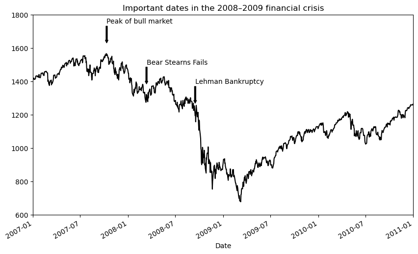
ax.set_title("Important dates in the 2008–2009 financial crisis")Text(0.5, 1.0, 'Important dates in the 2008–2009 financial crisis')fig, ax = plt.subplots(figsize=(12, 6))
rect = plt.Rectangle((0.2, 0.75), 0.4, 0.15, color="black", alpha=0.3)
circ = plt.Circle((0.7, 0.2), 0.15, color="blue", alpha=0.3)
pgon = plt.Polygon([[0.15, 0.15], [0.35, 0.4], [0.2, 0.6]],
color="green", alpha=0.5)
ax.add_patch(rect)
ax.add_patch(circ)
ax.add_patch(pgon)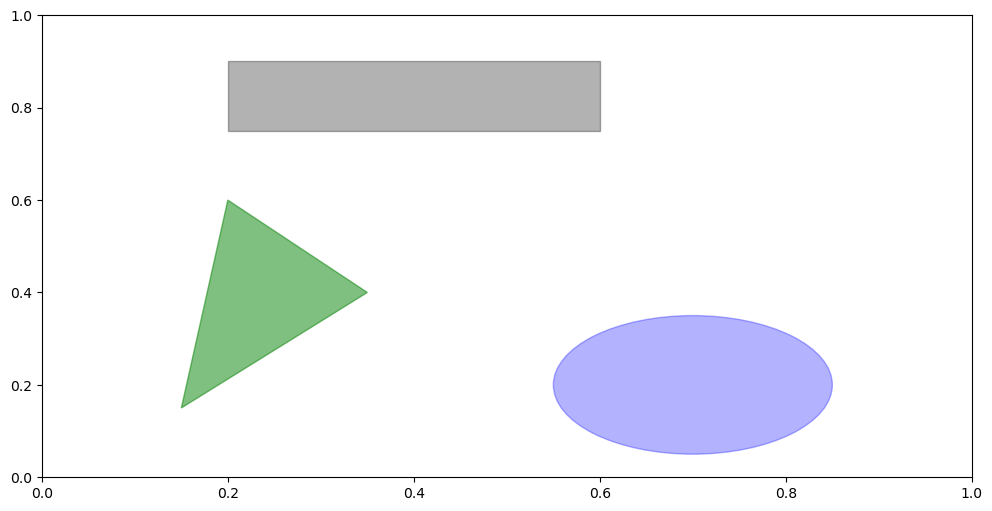
plt.close("all")s = pd.Series(np.random.standard_normal(10).cumsum(), index=np.arange(0, 100, 10))
s.plot()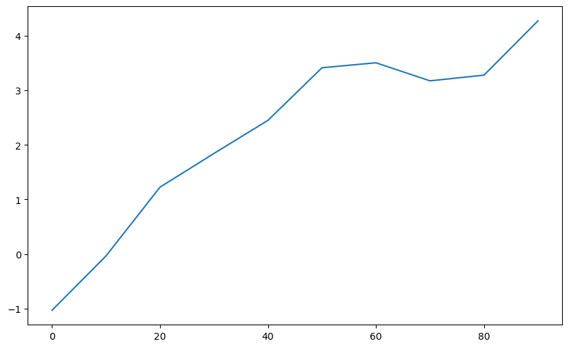
8.4 pandas와 seaborn을 활용한 시각화
데이터프레임을 활용하여 더 직관적이고 세련된 그래프를 그리는 방법을 살펴봅니다.
df = pd.DataFrame(np.random.standard_normal((10, 4)).cumsum(0),
                  columns=["A", "B", "C", "D"],
                  index=np.arange(0, 100, 10))
plt.style.use('grayscale')
df.plot()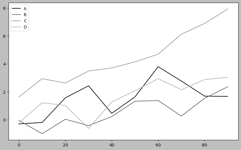
fig, axes = plt.subplots(2, 1)
data = pd.Series(np.random.uniform(size=16), index=list("abcdefghijklmnop"))
data.plot.bar(ax=axes[0], color="black", alpha=0.7)
data.plot.barh(ax=axes[1], color="black", alpha=0.7)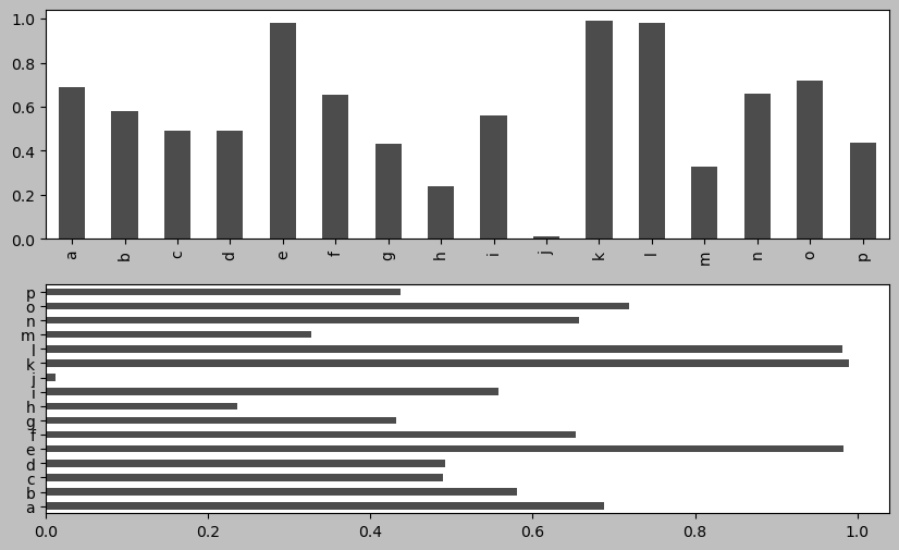
np.random.seed(12348)df = pd.DataFrame(np.random.uniform(size=(6, 4)),
index=["one", "two", "three", "four", "five", "six"],
columns=pd.Index(["A", "B", "C", "D"], name="Genus"))
df
df.plot.bar()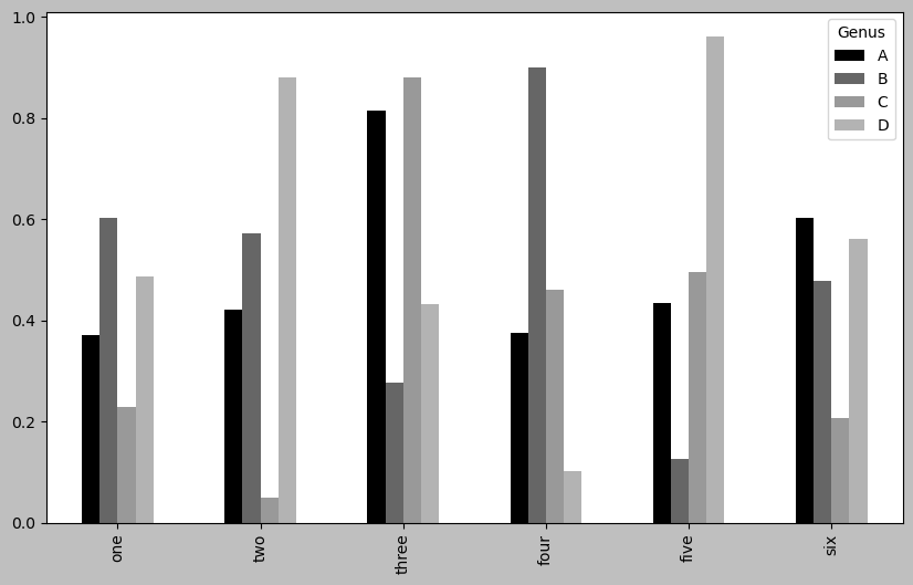
plt.figure()<Figure size 1000x600 with 0 Axes><Figure size 1000x600 with 0 Axes>df.plot.barh(stacked=True, alpha=0.5)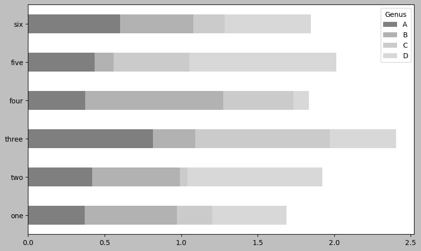
plt.close("all")tips = pd.read_csv("examples/tips.csv")
tips.head()
party_counts = pd.crosstab(tips["day"], tips["size"])
party_counts = party_counts.reindex(index=["Thur", "Fri", "Sat", "Sun"])
party_counts| size | 1 | 2 | 3 | 4 | 5 | 6 |
|---|---|---|---|---|---|---|
| day | ||||||
| Thur | 1 | 48 | 4 | 5 | 1 | 3 |
| Fri | 1 | 16 | 1 | 1 | 0 | 0 |
| Sat | 2 | 53 | 18 | 13 | 1 | 0 |
| Sun | 0 | 39 | 15 | 18 | 3 | 1 |
party_counts = party_counts.loc[:, 2:5]# Normalize to sum to 1
party_pcts = party_counts.div(party_counts.sum(axis="columns"),
axis="index")
party_pcts
party_pcts.plot.bar(stacked=True)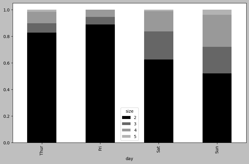
plt.close("all")8.5 seaborn을 활용한 통계 그래픽
복잡한 시각화를 간편하게 구현하는 seaborn 라이브러리를 사용해 봅니다.
import seaborn as sns

tips["tip_pct"] = tips["tip"] / (tips["total_bill"] - tips["tip"])
tips.head()
sns.barplot(x="tip_pct", y="day", data=tips, orient="h")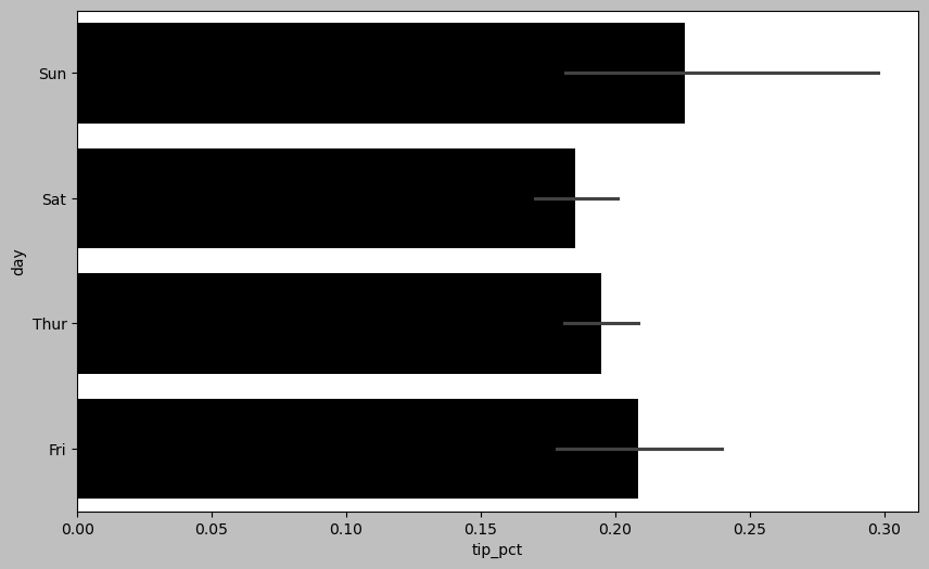
plt.close("all")sns.barplot(x="tip_pct", y="day", hue="time", data=tips, orient="h")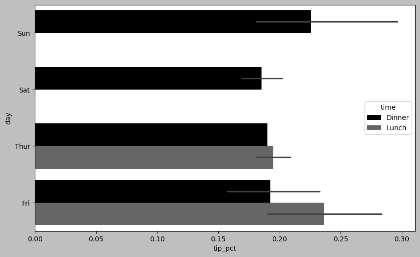
plt.close("all")sns.set_style("whitegrid")plt.figure()<Figure size 1000x600 with 0 Axes><Figure size 1000x600 with 0 Axes>tips["tip_pct"].plot.hist(bins=50)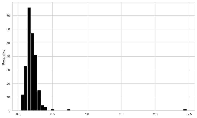
plt.figure()<Figure size 1000x600 with 0 Axes><Figure size 1000x600 with 0 Axes>tips["tip_pct"].plot.density()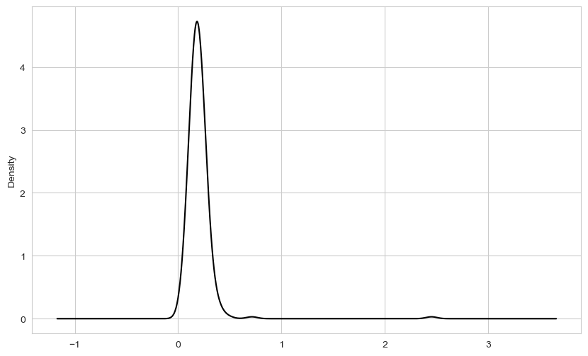
plt.figure()<Figure size 1000x600 with 0 Axes><Figure size 1000x600 with 0 Axes>comp1 = np.random.standard_normal(200)
comp2 = 10 + 2 * np.random.standard_normal(200)
values = pd.Series(np.concatenate([comp1, comp2]))
sns.histplot(values, bins=100, color="black")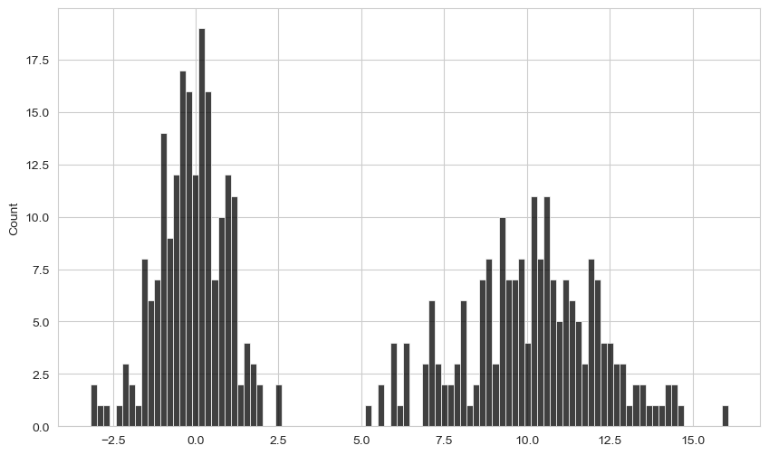
macro = pd.read_csv("examples/macrodata.csv")
data = macro[["cpi", "m1", "tbilrate", "unemp"]]
trans_data = np.log(data).diff().dropna()
trans_data.tail()| cpi | m1 | tbilrate | unemp | |
|---|---|---|---|---|
| 198 | -0.007904 | 0.045361 | -0.396881 | 0.105361 |
| 199 | -0.021979 | 0.066753 | -2.277267 | 0.139762 |
| 200 | 0.002340 | 0.010286 | 0.606136 | 0.160343 |
| 201 | 0.008419 | 0.037461 | -0.200671 | 0.127339 |
| 202 | 0.008894 | 0.012202 | -0.405465 | 0.042560 |
plt.figure()<Figure size 1000x600 with 0 Axes><Figure size 1000x600 with 0 Axes>ax = sns.regplot(x="m1", y="unemp", data=trans_data)
ax.set_title("Changes in log(m1) versus log(unemp)")Text(0.5, 1.0, 'Changes in log(m1) versus log(unemp)')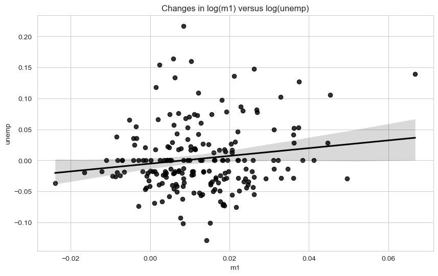
sns.pairplot(trans_data, diag_kind="kde", plot_kws={"alpha": 0.2})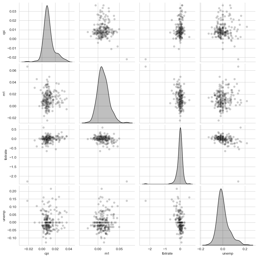
sns.catplot(x="day", y="tip_pct", hue="time", col="smoker",
            kind="bar", data=tips[tips.tip_pct < 1])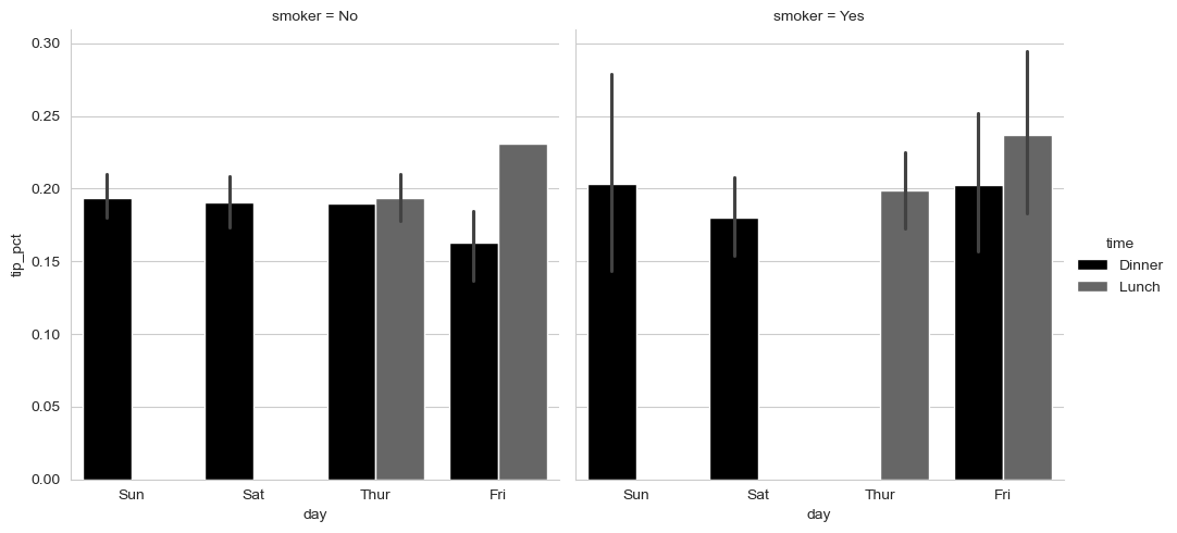
sns.catplot(x="day", y="tip_pct", row="time",
            col="smoker",
            kind="bar", data=tips[tips.tip_pct < 1])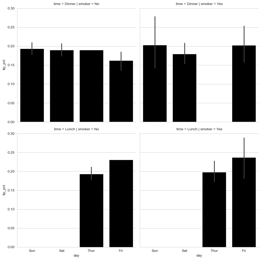
sns.catplot(x="tip_pct", y="day", kind="box",
            data=tips[tips.tip_pct < 0.5])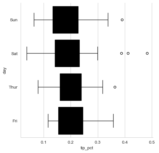
pd.options.display.max_rows = PREVIOUS_MAX_ROWS