1장 - 인과추론 소개
인과추론의 핵심은 상관관계에서 인과관계를 분리해내는 것입니다. 본 섹션에서는 인과추론의 기본 개념과 목적, 그리고 머신러닝과의 차이점에 대해 학습합니다.
앞으로 내용을 인과추론을 이해하는 데 필요한 용어와 인과추론이 왜 필요한지와 무엇을 할 수 있는지에 대해서 알아보겠습니다.
1.1 인과추론의 개념
인과관계는 하나의 변수가 다른 변수를 변화시키는 직접적인 영향을 의미합니다. 단순히 두 변수가 함께 움직이는 상관관계와는 구별되어야 합니다.
연관관계는 인과관계가 아니다. 그러나 때로는 연관관계가 인과관계가 될 수 있습니다.
1.2 인과추론의 목적
인과추론의 주된 목적은 처치(Treatment)가 결과(Outcome)에 미치는 효과를 추정하는 것입니다. 이를 통해 비즈니스 의사결정의 근거를 마련합니다.
1.3 머신러닝과 인과추론
머신러닝이 ‘무엇이 일어날까?’라는 예측에 집중한다면, 인과추론은 ’왜 일어났을까?’ 또는 ’내가 개입한다면 어떻게 바뀔까?’라는 질문에 답합니다.
1.4 연관관계와 인과관계
상관관계는 인과관계를 의미하지 않습니다. 데이터 속에 숨겨진 교란 요인을 배제해야만 진정한 인과 효과를 발견할 수 있습니다.
from pathlib import Pathimport pandas as pdimport numpy as npimport seaborn as snsfrom matplotlib import pyplot as pltfrom cycler import cycler# 기본 cycler 설정 = (= ["0.3" , "0.5" , "0.7" , "0.5" ])+ cycler(linestyle= ["-" , "--" , ":" , "-." ])+ cycler(marker= ["o" , "v" , "d" , "p" ])# 색상, 선 스타일, 마커 리스트 = ["0.3" , "0.5" , "0.7" , "0.5" ]= ["-" , "--" , ":" , "-." ]= ["o" , "v" , "d" , "p" ]# matplotlib rc 설정 "axes" , prop_cycle= default_cycler)"font" , size= 20 )# pathlib를 사용하여 파일 경로 설정 = Path("../data/xmas_sales.csv" )# 데이터 로드 = pd.read_csv(data_path)
1995
499
0
23.10
1
15.60
1996
500
3
20.52
0
154.68
1997
500
2
20.52
0
93.52
1998
500
1
20.52
1
111.16
1999
500
0
20.52
0
3.77
1.4.1 처치와 결과
처치(Treatment)는 우리가 효과를 알고 싶어 하는 개입이며, 결과(Outcome)는 그로 인해 변화하는 변수입니다.
1.4.2 인과추론의 근본적인 문제
개별 개체에 대해 처치를 받았을 때와 받지 않았을 때의 결과를 동시에 관찰할 수 없다는 점이 인과추론의 근본적인 한계입니다.
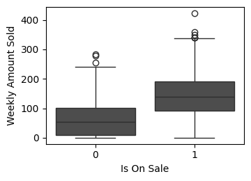
def plot_weekly_sales_boxplot(data: pd.DataFrame, ax: plt.Axes = None , figsize= (3 , 4 )):""" 할인 여부에 따른 주간 판매량 박스 플롯을 그립니다. Args: data (pd.DataFrame): 시각화할 데이터프레임 ('weekly_amount_sold', 'is_on_sale' 컬럼 필요). ax (plt.Axes, optional): 그림을 그릴 Axes 객체. None이면 새로운 figure와 axes를 생성합니다. """ if ax is None := plt.subplots(1 , 1 , figsize= figsize)= "weekly_amount_sold" , x= "is_on_sale" , data= data, ax= ax)# 폰트 크기 줄임 "Is On Sale" , fontsize= 10 )"Weekly Amount Sold" , fontsize= 10 )= "both" , which= "major" , labelsize= 10 )if ax is None :# 시각화 함수 호출 = (4 , 3 ))
1.4.3 인과모델
인과모델은 변수 간의 관계를 정의하여 개입의 효과를 추론할 수 있게 하는 틀입니다.
1.4.4 개입
개입(Intervention)은 시스템의 특정 변수 값을 인위적으로 조정하는 행위를 의미합니다.
1.4.5 개별 처치효과
개별 처치효과(ITE)는 특정 개체에 대해 처치가 있을 때와 없을 때의 결과 차이입니다.
1.4.6 잠재적 결과
잠재적 결과(Potential Outcomes)는 특정 처치 상태에서 나타날 수 있는 가상의 결과값들입니다.
1.4.8 인과 추정량
ATE(Average Treatment Effect)와 같은 지표를 통해 집단 전체의 인과 효과를 요약하여 측정합니다.
1.4.9 인과 추정량 예시
dict (= [1 , 2 , 3 , 4 , 5 , 6 ],= [200 , 120 , 300 , 450 , 600 , 600 ],= [220 , 140 , 400 , 500 , 600 , 800 ],= [0 , 0 , 0 , 1 , 1 , 1 ],= [0 , 0 , 1 , 0 , 0 , 1 ],= lambda d: (d["t" ] * d["y1" ] + (1 - d["t" ]) * d["y0" ]).astype(int ),= lambda d: d["y1" ] - d["y0" ],
0
1
200
220
0
0
200
20
1
2
120
140
0
0
120
20
2
3
300
400
0
1
300
100
3
4
450
500
1
0
500
50
4
5
600
600
1
0
600
0
5
6
600
800
1
1
800
200
dict (= [1 , 2 , 3 , 4 , 5 , 6 ],= [200 ,120 ,300 ,= [np.nan, np.nan, np.nan, 500 , 600 , 800 ],= [0 , 0 , 0 , 1 , 1 , 1 ],= [0 , 0 , 1 , 0 , 0 , 1 ],= lambda d: np.where(d["t" ] == 1 , d["y1" ], d["y0" ]).astype(int ),= lambda d: d["y1" ] - d["y0" ],
0
1
200.0
NaN
0
0
200
NaN
1
2
120.0
NaN
0
0
120
NaN
2
3
300.0
NaN
0
1
300
NaN
3
4
NaN
500.0
1
0
500
NaN
4
5
NaN
600.0
1
0
600
NaN
5
6
NaN
800.0
1
1
800
NaN
1.5 편향
1.5.2 편향의 시각적 가이드
from pathlib import Pathimport pandas as pdimport seaborn as snsfrom matplotlib import pyplot as pltfrom cycler import cycler# Nord 테마 색상 팔레트 정의 = ["#2E3440" ,"#3B4252" ,"#434C5E" ,"#4C566A" ,"#D8DEE9" ,"#E5E9F0" ,"#ECEFF4" ,"#8FBCBB" ,"#88C0D0" ,"#81A1C1" ,"#5E81AC" ,def plot_sales_with_regression(data: pd.DataFrame, ax: plt.Axes = None ):""" 주간 판매량과 평균 주간 판매액에 대한 산점도와 회귀선을 그립니다. 할인 여부에 따라 다른 색상과 마커를 사용하고, Nord 테마를 적용합니다. Args: data (pd.DataFrame): 시각화할 데이터프레임 ( 'avg_week_sales', 'weekly_amount_sold', 'is_on_sale' 컬럼 필요). ax (plt.Axes, optional): 그림을 그릴 Axes 객체. None이면 새로운 figure와 axes를 생성합니다. """ if ax is None := plt.subplots(figsize= (4 , 4 ))# Nord 테마 색상 적용 = nord_colors[7 ]= nord_colors[4 ]= "o" = "v" # 회귀선 그리기 = data,= "avg_week_sales" ,= "weekly_amount_sold" ,= None ,= False ,= nord_colors[3 ],= ax,# 할인 상품 산점도 = data[data["is_on_sale" ] == 1 ]= on_sale_data["avg_week_sales" ],= on_sale_data["weekly_amount_sold" ],= "on sale" ,= color_on_sale,= 0.9 ,= marker_on_sale,= 20 , # 점 크기 줄임 (선택 사항) # 비할인 상품 산점도 = data[data["is_on_sale" ] == 0 ]= not_on_sale_data["avg_week_sales" ],= not_on_sale_data["weekly_amount_sold" ],= "not on sale" ,= color_not_on_sale,= 0.9 ,= marker_not_on_sale,= 20 , # 점 크기 줄임 (선택 사항) # 범례 설정 (폰트 크기 줄임) = 10 )# 축 레이블 폰트 크기 줄임 "Average Weekly Sales" , fontsize= 8 )"Weekly Amount Sold" , fontsize= 8 )= "both" , which= "major" , labelsize= 6 # 눈금 레이블 폰트 크기 줄임 # 그래프 제목 폰트 크기 줄임 (선택 사항) "Weekly Sales vs. Average Weekly Sales" , fontsize= 10 )# 레이아웃 조정 if ax is None :# 시각화 함수 호출
2장 - 무작위 실험 및 기초 통계 리뷰
무작위 실험(Randomized Controlled Trial, RCT)은 인과추론의 골드 스탠다드로 불립니다. 본 섹션에서는 실험 설계와 결과 분석을 위한 통계적 기초를 다룹니다.
2.1 무작위 배정으로 독립성 확보하기
처치군과 대조군을 무작위로 나눔으로써, 처치 여부와 다른 잠재적 요인들 간의 상관관계를 끊어내고 독립성을 확보합니다.
2.2 A/B 테스트 사례
비즈니스 현장에서는 웹사이트 UI 변경이나 마케팅 메시지의 효과를 측정하기 위해 A/B 테스트를 적극적으로 활용합니다.
import pandas as pd # for data manipulation import numpy as np # for numerical computation = pd.read_csv("../data/cross_sell_email.csv" )
0
0
short
15
0
1
1
short
27
0
...
...
...
...
...
321
1
no_email
16
0
322
1
long
24
1
323 rows × 4 columns
"cross_sell_email" ]).mean())
cross_sell_email
long
0.550459
21.752294
0.055046
no_email
0.542553
20.489362
0.042553
short
0.633333
20.991667
0.125000
= ["gender" , "age" ]= data.groupby("cross_sell_email" )[X].mean()= data.groupby("cross_sell_email" )[X].var()= (mu - mu.loc["no_email" ]) / np.sqrt((var + var.loc["no_email" ]) / 2 )
cross_sell_email
long
0.015802
0.221423
no_email
0.000000
0.000000
short
0.184341
0.087370
2.4 가장 위험한 수식
import warnings"ignore" )import pandas as pdimport numpy as npfrom scipy import statsimport seaborn as snsfrom matplotlib import pyplot as pltfrom cycler import cyclerimport matplotlib= cycler(color= ["0.1" , "0.5" , "1.0" ])= ["0.3" , "0.5" , "0.7" , "0.9" ]= ["-" , "--" , ":" , "-." ]= ["o" , "v" , "d" , "p" ]"axes" , prop_cycle= default_cycler)"font.size" : 18 })
= pd.read_csv("data/enem_scores.csv" )= "avg_score" , ascending= False ).head(10 )
16670
2007
33062633
68
82.97
16796
2007
33065403
172
82.04
...
...
...
...
...
14636
2007
31311723
222
79.41
17318
2007
33087679
210
79.38
10 rows × 4 columns
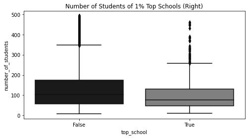
= df.assign(top_school= df["avg_score" ] >= np.quantile(df["avg_score" ], 0.99 ))["top_school" , "number_of_students" ]f"number_of_students< { np. quantile(df['number_of_students' ], 0.98 )} " # remove outliers = (8 , 4 ))= sns.boxplot(x= "top_school" , y= "number_of_students" , data= plot_data)"Number of Students of 1% Top Schools (Right)" )
Text(0.5, 1.0, 'Number of Students of 1% Top Schools (Right)')
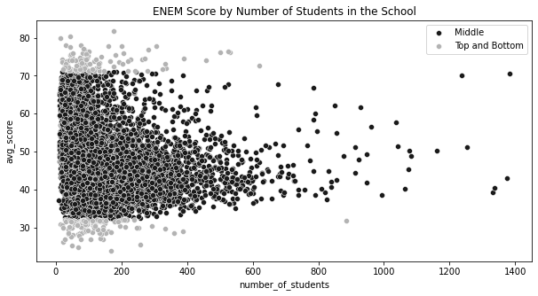
= np.quantile(df["avg_score" ], 0.99 )= np.quantile(df["avg_score" ], 0.01 )= df.sample(10000 ).assign(= lambda d: np.select("avg_score" ] > q_99) | (d["avg_score" ] < q_01)],"Top and Bottom" ],"Middle" ,= (10 , 5 ))= "avg_score" ,= "number_of_students" ,= plot_data.query("Group=='Middle'" ),= "Middle" ,= sns.scatterplot(= "avg_score" ,= "number_of_students" ,= plot_data.query("Group!='Middle'" ),= "0.7" ,= "Top and Bottom" ,"ENEM Score by Number of Students in the School" )
Text(0.5, 1.0, 'ENEM Score by Number of Students in the School')
2.5 추정값의 표준오차
= pd.read_csv("../data/cross_sell_email.csv" )= data.query("cross_sell_email=='short'" )["conversion" ]= data.query("cross_sell_email=='long'" )["conversion" ]= data.query("cross_sell_email!='no_email'" )["conversion" ]= data.query("cross_sell_email=='no_email'" )["conversion" ]"cross_sell_email" ).size()
cross_sell_email
long        109
no_email     94
short       120
dtype: int64
def se(y: pd.Series):return y.std() / np.sqrt(len (y))print ("SE for Long Email:" , se(long_email))print ("SE for Short Email:" , se(short_email))
SE for Long Email: 0.021946024609185506
SE for Short Email: 0.030316953129541618
print ("SE for Long Email:" , long_email.sem())print ("SE for Short Email:" , short_email.sem())
SE for Long Email: 0.021946024609185506
SE for Short Email: 0.030316953129541618
2.6 신뢰구간
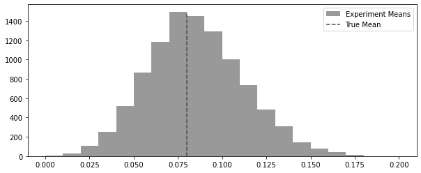
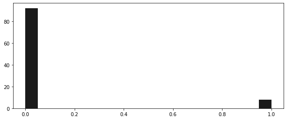
= 100 = 0.08 def run_experiment():return np.random.binomial(1 , conv_rate, size= n)42 )= [run_experiment().mean() for _ in range (10000 )]
= (10 , 4 ))= plt.hist(experiments, bins= 20 , label= "Experiment Means" , color= "0.6" )= 0 ,= freq.max (),= "dashed" ,= "True Mean" ,= "0.3" ,
<matplotlib.legend.Legend at 0x7fd451a4bc10>
42 )= (10 , 4 ))1 , 0.08 , 100 ), bins= 20 )
(array([92.,  0.,  0.,  0.,  0.,  0.,  0.,  0.,  0.,  0.,  0.,  0.,  0.,
         0.,  0.,  0.,  0.,  0.,  0.,  8.]),
 array([0.  , 0.05, 0.1 , 0.15, 0.2 , 0.25, 0.3 , 0.35, 0.4 , 0.45, 0.5 ,
        0.55, 0.6 , 0.65, 0.7 , 0.75, 0.8 , 0.85, 0.9 , 0.95, 1.  ]),
 <BarContainer object of 20 artists>)
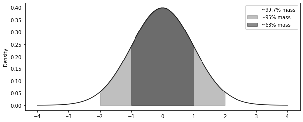
= np.linspace(- 4 , 4 , 100 )= stats.norm.pdf(x, 0 , 1 )= (10 , 4 ))= "solid" )- 3 , + 3 ), 0 , y, alpha= 0.5 , label= "~99.7% mass" , color= "C2" )- 2 , + 2 ), 0 , y, alpha= 0.5 , label= "~95% mass" , color= "C1" )- 1 , + 1 ), 0 , y, alpha= 0.5 , label= "~68% mass" , color= "C0" )"Density" )
<matplotlib.legend.Legend at 0x7fd451c295d0>
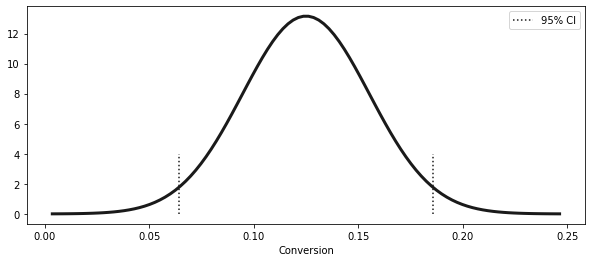
= short_email.sem()= short_email.mean()= (exp_mu - 2 * exp_se, exp_mu + 2 * exp_se)print ("95% CI for Short Email: " , ci)
95% CI for Short Email: (0.06436609374091676, 0.18563390625908324)
= np.linspace(exp_mu - 4 * exp_se, exp_mu + 4 * exp_se, 100 )= stats.norm.pdf(x, exp_mu, exp_se)= (10 , 4 ))= 3 )1 ], ymin= 0 , ymax= 4 , ls= "dotted" )0 ], ymin= 0 , ymax= 4 , ls= "dotted" , label= "95% CI" )"Conversion" )
<matplotlib.legend.Legend at 0x7fd46289cdd0>
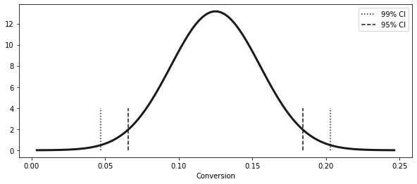
from scipy import stats= np.abs (stats.norm.ppf((1 - 0.99 ) / 2 ))print (z)= (exp_mu - z * exp_se, exp_mu + z * exp_se)
(0.04690870373460816, 0.20309129626539185)
1 - 0.99 ) / 2 )
= np.linspace(exp_mu - 4 * exp_se, exp_mu + 4 * exp_se, 100 )= stats.norm.pdf(x, exp_mu, exp_se)= (10 , 4 ))= 3 )1 ], ymin= 0 , ymax= 4 , ls= "dotted" )0 ], ymin= 0 , ymax= 4 , ls= "dotted" , label= "99% CI" )= (exp_mu - 1.96 * exp_se, exp_mu + 1.96 * exp_se)1 ], ymin= 0 , ymax= 4 , ls= "dashed" )0 ], ymin= 0 , ymax= 4 , ls= "dashed" , label= "95% CI" )"Conversion" )
<matplotlib.legend.Legend at 0x7fd462983b50>
def ci(y: pd.Series):return (y.mean() - 2 * y.sem(), y.mean() + 2 * y.sem())print ("95% CI for Short Email:" , ci(short_email))print ("95% CI for Long Email:" , ci(long_email))print ("95% CI for No Email:" , ci(no_email))
95% CI for Short Email: (0.06436609374091676, 0.18563390625908324)
95% CI for Long Email: (0.01115382234126202, 0.09893792077800403)
95% CI for No Email: (0.0006919679286838468, 0.08441441505003955)
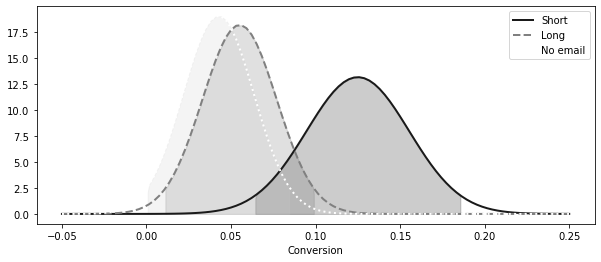
= (10 , 4 ))= np.linspace(- 0.05 , 0.25 , 100 )= stats.norm.pdf(x, short_email.mean(), short_email.sem())= 2 , label= "Short" , linestyle= linestyle[0 ])0 ], ci(short_email)[1 ]),0 ,= 0.2 ,= "0.0" ,= stats.norm.pdf(x, long_email.mean(), long_email.sem())= 2 , label= "Long" , linestyle= linestyle[1 ])0 ], ci(long_email)[1 ]), 0 , long_dist, alpha= 0.2 , color= "0.4" = stats.norm.pdf(x, no_email.mean(), no_email.sem())= 2 , label= "No email" , linestyle= linestyle[2 ])0 ], ci(no_email)[1 ]), 0 , no_email_dist, alpha= 0.2 , color= "0.8" "Conversion" )
<matplotlib.legend.Legend at 0x7fd451a96810>
2.7 가설검정
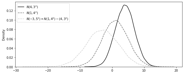
import seaborn as snsfrom matplotlib import pyplot as plt123 )= np.random.normal(4 , 3 , 30000 )= np.random.normal(1 , 4 , 30000 )= n2 - n1= (10 , 4 ))= False , label= "$N(4,3^2)$" , color= "0.0" , kde_kws= {"linestyle" : linestyle[0 ]}= False , label= "$N(1,4^2)$" , color= "0.4" , kde_kws= {"linestyle" : linestyle[1 ]}= False ,= "$N(-3, 5^2) = N(1,4^2) - (4,3^2)$" ,= "0.8" ,= {"linestyle" : linestyle[1 ]},;
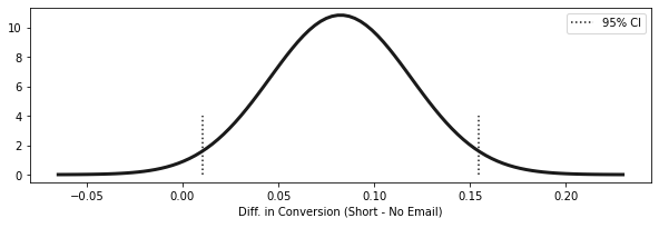
= short_email.mean() - no_email.mean()= np.sqrt(no_email.sem() ** 2 + short_email.sem() ** 2 )= (diff_mu - 1.96 * diff_se, diff_mu + 1.96 * diff_se)print (f"95% CI for the differece (short email - no email): \n { ci} " )
95% CI for the differece (short email - no email):
(0.01023980847439844, 0.15465380854687816)
= np.linspace(diff_mu - 4 * diff_se, diff_mu + 4 * diff_se, 100 )= stats.norm.pdf(x, diff_mu, diff_se)= (10 , 3 ))= 3 )1 ], ymin= 0 , ymax= 4 , ls= "dotted" )0 ], ymin= 0 , ymax= 4 , ls= "dotted" , label= "95% CI" )"Diff. in Conversion (Short - No Email) \n " )= 0.15 )
2.7.1 귀무가설
# shifting the CI = short_email.mean() - no_email.mean() - 0.01 = np.sqrt(no_email.sem() ** 2 + short_email.sem() ** 2 )= (diff_mu_shifted - 1.96 * diff_se, diff_mu_shifted + 1.96 * diff_se)print (f"95% CI 1% difference between (short email - no email): \n { ci} " )
95% CI 1% difference between (short email - no email):
(0.00023980847439844521, 0.14465380854687815)
2.7.2 검정통계량
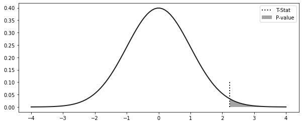
= (diff_mu - 0 ) / diff_se
2.8 p 값
= np.linspace(- 4 , 4 , 100 )= stats.norm.pdf(x, 0 , 1 )= (10 , 4 ))= 2 )= 0 , ymax= 0.1 , ls= "dotted" , label= "T-Stat" , lw= 2 )0 , y, alpha= 0.4 , label= "P-value" )
<matplotlib.legend.Legend at 0x7fd462fd6650>
print ("P-value:" , (1 - stats.norm.cdf(t_stat)) * 2 )
P-value: 0.025224235562152142
2.10 표본 크기 계산
# in the book it is np.ceil(16 * no_email.std()**2/0.01), but it is missing the **2 in the denominator. 16 * (no_email.std() / 0.08 ) ** 2 )
"cross_sell_email" ).size()
cross_sell_email
long        109
no_email     94
short       120
dtype: int64
3장 - 그래프 인과모델
3.1 인과관계에 대해 생각해보기
import warnings"ignore" )import pandas as pdimport numpy as npimport graphviz as gr= ["0.3" , "0.5" , "0.7" , "0.9" ]= ["-" , "--" , ":" , "-." ]= ["o" , "v" , "d" , "p" ]"display.max_rows" , 6 )"png" );
import pandas as pd= pd.read_csv("../data/cross_sell_email.csv" )
0
0
short
15
0
1
1
short
27
0
2
1
long
17
0
...
...
...
...
...
320
0
no_email
15
0
321
1
no_email
16
0
322
1
long
24
1
323 rows × 4 columns
3.1.1 인과관계 시각화
import graphviz as gr= gr.Digraph()"U" , "conversion" )"U" , "age" )"U" , "gender" )"rnd" , "cross_sell_email" )"cross_sell_email" , "conversion" )"age" , "conversion" )"gender" , "conversion" )
= gr.Digraph()"U" , "conversion" )"U" , "age" )"U" , "gender" )"rnd" , "cross_sell_email" )"cross_sell_email" , "conversion" )"age" , "conversion" )"gender" , "conversion" )
# rankdir:LR layers the graph from left to right = gr.Digraph(graph_attr= {"rankdir" : "LR" })"U" , "conversion" )"U" , "X" )"cross_sell_email" , "conversion" )"X" , "conversion" )
= gr.Digraph(graph_attr= {"rankdir" : "LR" })"U" , "conversion" )"U" , "X" )"cross_sell_email" , "conversion" )"X" , "conversion" )
3.1.2 컨설턴트 영입 여부 결정하기
= gr.Digraph(graph_attr= {"rankdir" : "LR" })"U1" , "profits_next_6m" )"U2" , "consultancy" )"U3" , "profits_prev_6m" )"consultancy" , "profits_next_6m" )"profits_prev_6m" , "consultancy" )"profits_prev_6m" , "profits_next_6m" )
= gr.Digraph(graph_attr= {"rankdir" : "LR" })"consultancy" , "profits_next_6m" )"profits_prev_6m" , "consultancy" )"profits_prev_6m" , "profits_next_6m" )
3.2 그래프 모델 집중 훈련
3.2.1 사슬
= gr.Digraph(graph_attr= {"rankdir" : "LR" })"T" , "M" )"M" , "Y" )"M" , "M" )"causal knowledge" , "solve problems" )"solve problems" , "job promotion" )
= gr.Digraph(graph_attr= {"rankdir" : "LR" })"T" , "M" )"M" , "Y" )"M" , "M" )"M" , color= "lightgrey" , style= "filled" )"causal knowledge" , "solve problems" )"solve problems" , "job promotion" )"solve problems" , color= "lightgrey" , style= "filled" )
3.2.2 분기
= gr.Digraph()"X" , "Y" )"X" , "T" )"X" , "X" )"statistics" , "causal inference" )"statistics" , "machine learning" )
= gr.Digraph()"good programmer" , "can invert a binary tree" )"good programmer" , "good employee" )
3.2.3 충돌부
= gr.Digraph()"Y" , "X" )"T" , "X" )"statistics" , "job promotion" )"flatter" , "job promotion" )
= gr.Digraph()"Y" , "X1" )"T" , "X1" )"X1" , "X2" )"X2" , color= "lightgrey" , style= "filled" )"statistics" , "job promotion" )"flatter" , "job promotion" )"job promotion" , "high salary" )"high salary" , color= "lightgrey" , style= "filled" )
3.2.5 파이썬에서 그래프 쿼리하기
= gr.Digraph(graph_attr= {"rankdir" : "LR" })"C" , "A" )"C" , "B" )"D" , "A" )"B" , "E" )"F" , "E" )"A" , "G" )
import networkx as nx= nx.DiGraph("C" , "A" ),"C" , "B" ),"D" , "A" ),"B" , "E" ),"F" , "E" ),"A" , "G" ),
print ("Are D and C dependent?" )print (not (nx.d_separated(model, {"D" }, {"C" }, {})))print ("Are D and C dependent given A?" )print (not (nx.d_separated(model, {"D" }, {"C" }, {"A" })))print ("Are D and C dependent given G?" )print (not (nx.d_separated(model, {"D" }, {"C" }, {"G" })))
Are D and C dependent?
False
Are D and C dependent given A?
True
Are D and C dependent given G?
True
print ("Are G and D dependent?" )print (not (nx.d_separated(model, {"G" }, {"D" }, {})))print ("Are G and D dependent given A?" )print (not (nx.d_separated(model, {"G" }, {"D" }, {"A" })))
Are G and D dependent?
True
Are G and D dependent given A?
False
print ("Are A and B dependent?" )print (not (nx.d_separated(model, {"A" }, {"B" }, {})))print ("Are A and B dependent given C?" )print (not (nx.d_separated(model, {"A" }, {"B" }, {"C" })))
Are A and B dependent?
True
Are A and B dependent given C?
False
print ("Are G and F dependent?" )print (not (nx.d_separated(model, {"G" }, {"F" }, {})))print ("Are G and F dependent given E?" )print (not (nx.d_separated(model, {"G" }, {"F" }, {"E" })))
Are G and F dependent?
False
Are G and F dependent given E?
True
3.3 식별 재해석
= gr.Digraph(graph_attr= {"rankdir" : "LR" })"profits_prev_6m" , "profits_next_6m" )"profits_prev_6m" , "consultancy" )
= nx.DiGraph("profits_prev_6m" , "profits_next_6m" ),"profits_prev_6m" , "consultancy" ),# ("consultancy", "profits_next_6m"), # causal relationship removed not ("consultancy" }, {"profits_next_6m" }, {})
= gr.Digraph(graph_attr= {"rankdir" : "LR" })"profits_prev_6m" , "profits_next_6m" )"profits_prev_6m" , "consultancy" )"consultancy" , "profits_next_6m" )"profits_prev_6m" , color= "lightgrey" , style= "filled" )
3.6 구체적인 식별 예제
= pd.DataFrame(dict (= [1.0 , 1.0 , 1.0 , 5.0 , 5.0 , 5.0 ],= [0 , 0 , 1 , 0 , 1 , 1 ],= [1 , 1.1 , 1.2 , 5.5 , 5.7 , 5.7 ],
0
1.0
0
1.0
1
1.0
0
1.1
2
1.0
1
1.2
3
5.0
0
5.5
4
5.0
1
5.7
5
5.0
1
5.7
"consultancy==1" )["profits_next_6m" ].mean()- df.query("consultancy==0" )["profits_next_6m" ].mean()
= df.groupby(["consultancy" , "profits_prev_6m" ])["profits_next_6m" ].mean()1 ] - avg_df.loc[0 ]
profits_prev_6m
1.0    0.15
5.0    0.20
Name: profits_next_6m, dtype: float64
= gr.Digraph(graph_attr= {"rankdir" : "LR" })"U" , "T" )"U" , "Y" )"T" , "M" )"M" , "Y" )
3.7 교란편향
= gr.Digraph(graph_attr= {"rankdir" : "LR" })"X" , "T" )"X" , "Y" )"T" , "Y" )"Manager Quality" , "Training" ),)"Manager Quality" , "Engagement" ),)"Training" , "Engagement" )
3.7.1 대리 교란 요인
= gr.Digraph()"X1" , "U" )"U" , "X2" )"U" , "T" )"T" , "Y" )"U" , "Y" )"Manager Quality" , "Team's Attrition" )"Manager Quality" , "Team's Past Performance" )"Manager's Tenure" , "Manager Quality" )"Manager's Education Level" , "Manager Quality" )"Manager Quality" , "Training" )"Training" , "Engagement" )"Manager Quality" , "Engagement" )
3.7.2 랜덤화 재해석
= gr.Digraph(graph_attr= {"rankdir" : "LR" })"rnd" , "T" )"T" , "Y" )"U" , "Y" )
3.8 선택편향
3.8.1 충돌부 조건부 설정
= gr.Digraph(graph_attr= {"rankdir" : "LR" })"T" , "S" )"T" , "Y" )"Y" , "S" )"S" , color= "lightgrey" , style= "filled" )"RND" , "New Feature" ),)"New Feature" , "Customer Satisfaction" ),)"Customer Satisfaction" , "NPS" ),)"Customer Satisfaction" , "Response" ),)"New Feature" , "Response" ),)"Response" , "Response" , color= "lightgrey" , style= "filled" )
= nx.DiGraph("RND" , "New Feature" ),# ("New Feature", "Customer Satisfaction"), "Customer Satisfaction" , "NPS" ),"Customer Satisfaction" , "Response" ),"New Feature" , "Response" ),not (nx.d_separated(nps_model, {"NPS" }, {"New Feature" }, {"Response" }))
2 )= 100000 = np.random.binomial(1 , 0.5 , n)= np.random.normal(0 , 0.5 , n)= satisfaction_0 + 0.4 = new_feature * satisfaction_1 + (1 - new_feature) * satisfaction_0= np.random.normal(satisfaction_0, 1 )= np.random.normal(satisfaction_1, 1 )= new_feature * nps_1 + (1 - new_feature) * nps_0= (np.random.normal(0 + new_feature + satisfaction, 1 ) > 1 ).astype(int )= pd.DataFrame(dict (= new_feature, responded= responded, nps_0= nps_0, nps_1= nps_1, nps= nps= pd.DataFrame(dict (= new_feature,= responded,= np.nan,= np.nan,= np.where(responded, nps, np.nan),"new_feature" ).mean()
new_feature
0
0.183715
-0.005047
0.395015
-0.005047
1
0.639342
-0.005239
0.401082
0.401082
"new_feature" ).mean().assign(** {"nps" : np.nan})
new_feature
0
0.183715
NaN
NaN
NaN
1
0.639342
NaN
NaN
NaN
"responded" , "new_feature" ]).mean()
responded
new_feature
0
0
NaN
NaN
NaN
1
NaN
NaN
NaN
1
0
NaN
NaN
0.314073
1
NaN
NaN
0.536106
"responded" , "new_feature" ]).mean()
responded
new_feature
0
0
-0.076869
0.320616
-0.076869
1
-0.234852
0.161725
0.161725
1
0
0.314073
0.725585
0.314073
1
0.124287
0.536106
0.536106
3.8.2 선택편향 보정
= gr.Digraph()"U" , "X" )"X" , "S" )"U" , "Y" )"T" , "Y" )"T" , "S" )"S" , color= "lightgrey" , style= "filled" )"New Feature" , "Customer Satisfaction" ),)"Unknown Stuff" , "Customer Satisfaction" ),)"Unknown Stuff" , "Time in App" ),)"Time in App" , "Response" ),)"New Feature" , "Response" ),)"Response" , "Response" , color= "lightgrey" , style= "filled" )
= gr.Digraph(graph_attr= {"rankdir" : "LR" })"X1" , "U" )"U" , "X2" )"X5" , "S" )"U" , "Y" , style= "dashed" )"U" , "S" , style= "dashed" )"U" , "X3" )"X3" , "S" )"Y" , "X4" )"X4" , "S" )"T" , "X5" )"T" , "Y" )"T" , "S" , style= "dashed" )"S" , color= "lightgrey" , style= "filled" )
= gr.Digraph(graph_attr= {"rankdir" : "LR" })"Y" , "X" )"T" , "X" )"T" , "Y" );
3.8.3 매개자 조건부 설정
= gr.Digraph(graph_attr= {"rankdir" : "LR" })"T" , "M" )"T" , "Y" )"M" , "Y" )"M" , color= "lightgrey" , style= "filled" )"woman" , "seniority" )"woman" , "salary" )"seniority" , "salary" )"seniority" , color= "lightgrey" , style= "filled" )
= gr.Digraph(graph_attr= {"rankdir" : "LR" })"T" , "M" )"T" , "Y" )"M" , "Y" )"M" , "X" )"X" , color= "lightgrey" , style= "filled" )
3.9 요약
= gr.Digraph(graph_attr= {"rankdir" : "LR" , "ratio" : "0.3" })"U" , "T" )"U" , "Y" )"T" , "Y" )
= gr.Digraph(graph_attr= {"rankdir" : "LR" })"T" , "M" )"M" , "Y" )"T" , "Y" )"T" , "S" )"Y" , "S" )"M" , color= "lightgrey" , style= "filled" )"S" , color= "lightgrey" , style= "filled" )
= gr.Digraph(graph_attr= {"rankdir" : "LR" })"T" , "In-Game Purchase" )"T" , "In-Game Purchase > 0" )"In-Game Purchase" , "In-Game Purchase > 0" )"In-Game Purchase > 0" , color= "lightgrey" , style= "filled" )
= gr.Digraph(graph_attr= {"rankdir" : "LR" })"loan amount" , "Default at yr=1" )"Default at yr=1" , "Default at yr=2" )"Default at yr=2" , "Default at yr=3" )"U" , "Default at yr=1" )"U" , "Default at yr=2" )"U" , "Default at yr=3" )"Default at yr=1" , color= "lightgrey" , style= "filled" )"Default at yr=2" , color= "darkgrey" , style= "filled" )