R로 서열분석하기

R을 이용해서 간단한 생물정보학(bioinformatics) 분석을 해보도록 할게요. 여기서 우리가 초점을 맞출 것은 단백질의 서열입니다.

생물학에 대한 기초적인 이해가 있다고 가정하고 R로 분석하는 것 위주로 설명을 할 겁니다. R을 사용하기 위해서는 일단 컴퓨터에 설치를 해야 할텐데요. 설치가 되어 있지 않다면 다음 링크를 참고해서 설치하도록 하세요.

0. 생물정보학 위한 R packages:

두 가지의 유명한 패키지가 알려져있습니다.

  • Bioconductor
  • SeqinR

각각의 특징을 간략하게 알아보자면 Bioconductor는 마이크로 어레이 데이터 같은 비교적 큰 데이터 분석을 위한 툴들을 제공합니다. 반면에, SeqinR은 DNA나 단백질 서열을 분석하는데 중점을 두고 있습니다. 여기서는 SeqinR을 사용해볼 겁니다.

SeqinR을 사용하기 위해서는 먼저 설치부터 해야겠죠. 다음 명령어를 통해 설치를 하고, 실행을 해봅시다.

In [1]:
# package 설치하기
install.packages('seqinr')
# package 실행
library('seqinr')
Updating HTML index of packages in '.Library'
Making 'packages.html' ... done

FASTA 형식(format)

FASTA 형식은 간단하고 많이 사용되는 형태의 파일입니다. sequence alignment용 FASTA라는 프로그램에서 처음으로 사용되었죠. 아래에 예시가 있습니다. 시퀀스에 대한 설명은 > 꺽쇄로 시작한 첫번째 줄에 적혀 있고, 다음 줄에는 서열 정보가 들어갑니다.

> A06852 183 residues
MPRLFSYLLGVWLLLSQLPREIPGQSTNDFIKACGRELVRLWVEICGSVSWGRTALSLEE
PQLETGPPAETMPSSITKDAEILKMMLEFVPNLPQELKATLSERQPSLRELQQSASKDSN
LNFEEFKKIILNRQNEAEDKSLLELKNLGLDKHSRKKRLFRMTLSEKCCQVGCIRKDIAR

1. 서열 정보를 R로 읽어오기

SeqinR 패키지를 사용해서 파스타(FASTA) 파일을 읽어 보도록 해보겠습니다.

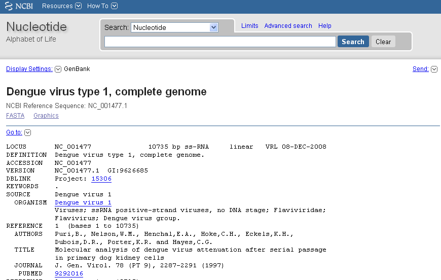
NCBI에 NC_001477로 accession 되어 있는 DEN-1 Dengue virus genome sequence의 파스타 파일을 다운받아 주세요. 파일명은 DEN-1.fasta로 하겠습니다.

getncbiseq()을 이용해 한번에 불러오는 방법도 있어요.

다운받은 파스타 파일이 있는 폴더에서 아래의 명령어를 입력합니다.

In [2]:
library("seqinr")

dengue <- read.fasta(file = "den1.fasta")
# In fact, the first element of the list object dengue contains the the DNA sequence
dengueseq <- dengue[[1]]

DNA 서열의 길이

DNA 서열을 불러온 다음에는 제대로 불어왔는지를 확인하기 위해 총 서열의 길이를 알아 보도록 하겠습니다.

In [3]:
length(dengueseq)
10735

10735개의 DNA 서열로 구성되어있다는 것을 알 수 있군요.

원하는 부분의 서열만 얻기

DNA 서열에서도 특정 부분만 필요할 때가 있습니다. DEN-1 Dengue virus genome sequence의 처음부터 50번째 까지의 서열을 확인해보겠습니다.

In [4]:
print(dengueseq[1:50])
 [1] "a" "g" "t" "t" "g" "t" "t" "a" "g" "t" "c" "t" "a" "c" "g" "t" "g" "g" "a"
[20] "c" "c" "g" "a" "c" "a" "a" "g" "a" "a" "c" "a" "g" "t" "t" "t" "c" "g" "a"
[39] "a" "t" "c" "g" "g" "a" "a" "g" "c" "t" "t" "g"

DNA 서열상의 염기 구성

DNA는 4가지의 nucleotides (“A”, “C”, “G”, “T”) 로 구성되어 있습니다. DEN-1.fasta에 각각이 몇개나 있는지 알아 보도록 하죠.

In [5]:
table(dengueseq)
dengueseq
   a    c    g    t 
3426 2240 2770 2299 

DEN-1 Dengue virus genome sequence에는 3426개의 A, 2240개의 C, 2770개의 G and 그리고 2299개의 T로 구성되어 있군요.

GC Content of DNA

genome sequene에서 가장 기초적인 분석은 GC content 입니다. DNA 서열상에 G와 C의 비율이 얼마나 되는지를 표현하죠. SeqinR에서는 GC() 기능을 제공하기 때문에 손쉽게 알아 볼 수 있습니다.

In [6]:
GC(dengueseq)
0.466697717745692

GC content는 총 46.66977%입니다. 약간 적은 편이네요.

특정 부분의 GC content

좀전의 분석은 전체 서열상에서 평균 GC content이었습니다. 하지만 DNA서열상의 특정부분에서의 GC content는 어떻게 알 수 있을까요?

전체서열을 여러개의 조각으로 나누어 GC()기능을 사용해보겠습니다. 예시로 여기서는 300개씩 잘라보았습니다.

In [7]:
slidingwindowplot <- function(windowsize, inputseq)
{
   starts <- seq(1, length(inputseq)-windowsize, by = windowsize)
   n <- length(starts)    # Find the length of the vector "starts"
   chunkGCs <- numeric(n) # Make a vector of the same length as vector "starts", but just containing zeroes
   for (i in 1:n) {
        chunk <- inputseq[starts[i]:(starts[i]+windowsize-1)]
        chunkGC <- GC(chunk)
        # print(chunkGC)
        chunkGCs[i] <- chunkGC
   }
   plot(starts,chunkGCs,type="b",xlab="Nucleotide start position",ylab="GC content")
}

# 300개씩 서열을 나누어서 GC() 기능을 사용합니다.
slidingwindowplot(300, dengueseq)
No description has been provided for this image

전체적인 서열상에서 GC contents가 특별하게 낮은 구역은 4000번(40%) 즈음이군요.

파스타(FASTA) 파일 쓰기

파스타 파일을 불러들여 간단히 분석을 해보았는데, 이제는 편집한 서열을 파스타 파일로 저장하는 방법을 알아보겠습니다.

아래와 같이 작성해주면, den1.fasta라는 파일이 폴더에 생긴것을 확인 할수 있어요.

In [8]:
write.fasta(names="DEN-1", sequences=dengueseq, file.out="den1.fasta")

파스타 파일에서 단백질 서열을 불러오기

SeqinR을 사용하면 DNA 서열과 동일한 방법으로 단백질 서열도 읽을수 있습니다. Uniprot 에 각각 Q9CD83 , A0PQ23으로 저장되어 있는 단백질 서열의 파스타 파일을 다운받으세요.

예시로 사용한 Q9CD83, A0PQ23 ?

Q9CD83A0PQ23 는 Chorismate pyruvate-lyase라는 효소입니다. 차이점은 서로 다른 균주에서 발현된다는 것입니다.

  • Q9CD83은 Mycobacterium leprae
  • A0PQ23은 Mycobacterium ulcerans

R에서 아래와 같이 입력하세요.

In [9]:
leprae <- read.fasta(file = "Q9CD83.fasta")
lepraeseq <- leprae[[1]]

ulcerans <- read.fasta(file = "A0PQ23.fasta")
ulceransseq <- ulcerans[[1]]

lepraeseq # Display the contents of "lepraeseq"
  [1] "m" "t" "n" "r" "t" "l" "s" "r" "e" "e" "i" "r" "k" "l" "d" "r" "d" "l"
 [19] "r" "i" "l" "v" "a" "t" "n" "g" "t" "l" "t" "r" "v" "l" "n" "v" "v" "a"
 [37] "n" "e" "e" "i" "v" "v" "d" "i" "i" "n" "q" "q" "l" "l" "d" "v" "a" "p"
 [55] "k" "i" "p" "e" "l" "e" "n" "l" "k" "i" "g" "r" "i" "l" "q" "r" "d" "i"
 [73] "l" "l" "k" "g" "q" "k" "s" "g" "i" "l" "f" "v" "a" "a" "e" "s" "l" "i"
 [91] "v" "i" "d" "l" "l" "p" "t" "a" "i" "t" "t" "y" "l" "t" "k" "t" "h" "h"
[109] "p" "i" "g" "e" "i" "m" "a" "a" "s" "r" "i" "e" "t" "y" "k" "e" "d" "a"
[127] "q" "v" "w" "i" "g" "d" "l" "p" "c" "w" "l" "a" "d" "y" "g" "y" "w" "d"
[145] "l" "p" "k" "r" "a" "v" "g" "r" "r" "y" "r" "i" "i" "a" "g" "g" "q" "p"
[163] "v" "i" "i" "t" "t" "e" "y" "f" "l" "r" "s" "v" "f" "q" "d" "t" "p" "r"
[181] "e" "e" "l" "d" "r" "c" "q" "y" "s" "n" "d" "i" "d" "t" "r" "s" "g" "d"
[199] "r" "f" "v" "l" "h" "g" "r" "v" "f" "k" "n" "l"
attr(,"name")
[1] "sp|Q9CD83|PHBS_MYCLE"
attr(,"Annot")
[1] ">sp|Q9CD83|PHBS_MYCLE Chorismate pyruvate-lyase OS=Mycobacterium leprae (strain TN) GN=ML0133 PE=3 SV=1"
attr(,"class")
[1] "SeqFastadna"

파스타 파일이 아미노산 서열을 담고 있는것을 확인할 수 있고, 서열으 정보(균주, 이름)등을 알수 있군요.

두 서열을 점도표로 비교하기

두가지의 서열을 비교할때는 먼저 점도표(dotplot)을 그려보는것은 언제나 좋은 생각입니다.

dotPlot()이라는 기능으로 쉽게 그려 볼 수 있죠. 위에서 예로 들었던 Mycobacterium lepraeMycobacterium ulcerans의 Chorismate pyruvate-lyase를 비교해보도록 하죠.

In [10]:
dotPlot(lepraeseq, ulceransseq)
No description has been provided for this image

위의 점도표에서, M. leprae의 서열은 x축에, M. ulcerans의 서열은 y축으로 표현되어 있습니다. 두개의 서열이 동일하면 점으로 표시됩니다. 예를 들어 x축의 아미노산 50번과 y축의 53번째 아미노산이 동일하기때문에 점이 찍혀 있습니다.

두개의 서열이 유사할수록 대각선이 선명하게 나타납니다. 우리가 사용한 단백질 서열은 서로 유사한 효소(homologues)이기 때문에 예상한것 처럼 선명한 대각선을 볼 수 있죠.

코돈표

SeqinR 패키지에는 tablecode() 라는 기능으로 표준 코돈표를 제공하고 있습니다. 아래와 같이 확인할 수 있죠.

보통 인터넷에서 쉽게 확인 할 수 있는것이라 큰 쓸모는 없을 수도 있겠습니다.

In [11]:
tablecode()
No description has been provided for this image

마치며

RSeqinR이라는 패키지를 사용해 생물학적 서열정보를 간략하게 분석해보았습니다. R에서 기본적으로 제공하는 다음의 기능과

  • 벡터(vector)나 리스트(list)의 길이를 알 수 있는 length()
  • 벡터(vector)나 리스트(list)의 구성성분의 갯수를 알려주는 table()

SeqinR 패키지에서 제공하는 기능

  • DNA 서열의 GC content를 계산해주는 GC()

를 기억해주세요.

Source

파이썬 시각화 예제

소개

Matplotlib는 파이썬에서 자료를 차트(chart)나 플롯(plot)으로 시각화(visulaization)하는 패키지입니다.

주피터(Jupyter) 노트북을 사용하는 경우에는 다음처럼 매직(magic) 명령으로 노트북 내부에 그림을 표시하도록 지정해야 합니다.

%matplotlib inline

그림의 구조

Matplotlib의 그림은 Figure 객체, Axes 객체, Axis 객체 등으로 구성되어 있습니다. Figure 객체는 한 개 이상의 Axes 객체를 포함하고 Axes 객체는 다시 두 개 이상의 Axis 객체를 포함합니다. 말로 하면 이해하기 힘드니 그림으로 보겠습니다.

Figure는 그림이 그려지는 캔버스나 종이를 뜻하고 Axes는 하나의 그림, 그리고 Axis는 가로축이나 세로축 등의 축입니다.

참고

  • 효과적으로 matplotlib사용하기 링크
  • Matplotlib를 사용한 시각화 예제들을 보고 싶다면 Matplotlib 갤러리를 방문하세요.
  • 데이터 사이언스 스쿨의 Matplotlib 소개

테스트하기

In [2]:
# 필요한 모듈을 불러옵니다.
import matplotlib.pyplot as plt

%matplotlib inline

# 그래프를 그릴 X, Y 값을 입력합니다.
x = [1, 2, 3, 4, 5, 6, 7, 8, 9, 10]
y = [2, 3, 4, 6, 7, 9, 10, 16, 17, 20]

# Get the figure and the axes
fig, (ax0, ax1) = plt.subplots(nrows=1, ncols=2, sharey=False, figsize=(8, 4))

# 첫번째 그래프
ax0.plot(x, y)  # 선 그래프
ax0.set_ylim([2, 20])  # y축의 값을 지정
ax0.set(title="First", xlabel="Score", ylabel="Time")

# 두번째 그래프
ax1.bar(x, y)  # 막대 그래프
ax1.set_ylim([0, 30])
ax1.set(title="Second", xlabel="Score", ylabel="Time")

# Title the figure
fig.suptitle("TEST", fontsize=14, fontweight="bold")
Out[2]:
Text(0.5,0.98,'TEST')
No description has been provided for this image

막대 그래프 (Bar graph)

두가지 그룹 (group1, group2)에 각각 (E7, E8, E9, E10) 샘플이 있고 여러번 값을 측정하여 표준편차를 에러바로 표시하였습니다.

In [2]:
# 필요한 모듈을 임포트
import numpy as np
import matplotlib.pyplot as plt

%matplotlib inline

# number of data in each group
n_groups = 4

# 각 데이터의 평균
means_group1 = (121.32, 272.88, 277.08, 227.03)
means_group2 = (141.21, 472.15, 457.01, 327.34)

# 각 데이터의 표준편차
std_group1 = (8.0, 5.8, 2.0, 19.9)
std_group2 = (5.0, 15.8, 12.0, 9.1)
fig, ax = plt.subplots()
index = np.arange(n_groups)
bar_width = 0.3  # space between bar
rects2 = plt.bar(
    index,
    means_group1,
    bar_width,
    # color='r' , # color of bar
    yerr=std_group1,  # error bar
    capsize=3,  # cap length for error bar
    ecolor="k",  # color of error bar
    label="group1",
)
rects2 = plt.bar(
    index + bar_width,
    means_group2,
    bar_width,
    # color='b', # color of bar
    yerr=std_group2,  # error bar
    capsize=3,  # cap length for error bar
    ecolor="k",  # color of error bar
    label="treatment group",
)

plt.xlabel("Sample")  # x축 이름
plt.ylabel("mg/ml")  # y축 이름
plt.title("TEST")  # 그래프 이름
plt.xticks(index + bar_width / 2, ("E7", "E8", "E9", "E10"))  # x축 틱
plt.legend()  # 레전드 표시
plt.show()
No description has been provided for this image

겹친 막대 그래프

In [3]:
A = [5.0, 30.0, 45.0, 22.0]
B = [5.0, 25.0, 50.0, 20.0]

X = range(4)
plt.bar(X, A)
plt.bar(X, B, bottom=A)
Out[3]:
<Container object of 4 artists>
No description has been provided for this image

수평 막대 그래프

In [5]:
import numpy as np
import matplotlib.pyplot as plt

women_pop = np.array([5.0, 30.0, 45.0, 22.0])
men_pop = np.array([5.0, 25.0, 50.0, 20.0])
X = np.arange(4)

plt.barh(X, women_pop, label="women")
plt.barh(X, -men_pop, label="man")
plt.legend()
Out[5]:
<matplotlib.legend.Legend at 0x84c3e48>
No description has been provided for this image

에러바 있는 선 그래프

In [3]:
import matplotlib.pyplot as plt

# Data to draw
x = [0.083, 1, 2, 4, 8]
y = [523.11, 62.32, 37.93, 24.85, 13.81]
y2 = [733.31, 220.25, 132.63, 72.63, 25.17]
std = [101.62, 22.61, 13.00, 4.64, 3.56]


fig, ax = plt.subplots(nrows=1, ncols=1, figsize=(5, 4))
# fig = plt.figure() # figure setting
# ax = fig.add_subplot(1,1,1) # Get the figure and the axes

#
ax.errorbar(x, y, std, fmt="ko-", capsize=3)  # 에러바가 있는 선 그래프를 그려줍니다.
ax.errorbar(x, y2, std, fmt="o--", capsize=3)  # 에러바가 있는 선 그래프를 그려줍니다.

# Label과 Title을 정해줍니다.
ax.set(title="Pharmacokinetics ", xlabel="Hours", ylabel="Protein conc.")
# Y축을 log로 바꾸어 줍니다.
ax.set_yscale("log")
plt.show()
No description has been provided for this image

scatter plot

In [4]:
import numpy as np
import matplotlib.pyplot as plt

line = plt.figure()

np.random.seed(5)
x = np.arange(1, 101)
y = 20 + 3 * x + np.random.normal(0, 60, 100)
plt.plot(x, y, "o")
plt.show()
Out[4]:
[<matplotlib.lines.Line2D at 0x8524400>]
No description has been provided for this image

박스 그래프(Box plot)

정확한 명칭은 box-and-whisker plot입니다. 통계학적으로 유용한 여러값을 한번에 시각화 해줍니다.

  • 중앙값(Median)
  • 박스(Box): 25~75%의 값을 표현, 가장 아래가 Q1이고 가장 위가 Q3입니다.
  • 수염(Whiskers): 박스의 위아래로 Q1~Q3으로 부터 1.5배 내에 있는 가장 떨어진 데이터
  • 이상치(Outlier): 수염보다 멀리있는 값
In [5]:
import matplotlib.pyplot as plt
import numpy as np

## Create data
np.random.seed(10)
collectn_1 = np.random.normal(100, 10, 200)
collectn_2 = np.random.normal(80, 30, 200)
collectn_3 = np.random.normal(90, 20, 200)
collectn_4 = np.random.normal(70, 25, 200)

## combine these different collections into a list
data = [collectn_1, collectn_2, collectn_3, collectn_4]

fig1, ax = plt.subplots(nrows=1, ncols=1, figsize=(8, 4))

# plotting
ax.boxplot(data)

## Custom x-axis labels
ax.set_xticklabels(["Sample1", "Sample2", "Sample3", "Sample4"])
plt.show()
Out[5]:
[Text(0,0,'Sample1'),
 Text(0,0,'Sample2'),
 Text(0,0,'Sample3'),
 Text(0,0,'Sample4')]
No description has been provided for this image
In [7]:
data = np.random.randn(100)
# 정규분포에서 얻은 100개의 값을 생성
plt.boxplot(data)
# 값 집합을 취한후, 자체에서 평균값, 중앙값과 다른 통계수량을 계산한다.
plt.show()
# 빨간 막대는 평균값, 파란상자는 제 1사분위수부터 제 3사분위수까지의 데이터의 절반을 포함한다 = 데이터평균값의 중심이다.
No description has been provided for this image

히스토그램(Histogram)

히스토그램(histogram)은 표로 되어 있는 도수 분포를 정보 그림으로 나타낸 것이다. 더 간단하게 말하면, 도수분포표를 그래프로 나타낸 것이다

In [8]:
N_points = 100000
n_bins = 20

# Generate a normal distribution, center at x=0 and y=5
x = np.random.randn(N_points)
y = 0.4 * x + np.random.randn(100000) + 5

fig, ax = plt.subplots()

# We can set the number of bins with the `bins` kwarg
ax.hist(x, bins=n_bins)
plt.show()
No description has been provided for this image

triplot

In [8]:
import matplotlib.tri as tri

data = np.random.rand(100, 2)

triangles = tri.Triangulation(data[:, 0], data[:, 1])

plt.triplot(triangles)
Out[8]:
[<matplotlib.lines.Line2D at 0x860afd0>,
 <matplotlib.lines.Line2D at 0x8613198>]
No description has been provided for this image

2.컬러와 스타일 사용자 정의

In [9]:
def pdf(X, mu, sigma):
    a = 1.0 / (sigma * np.sqrt(2.0 * np.pi))
    b = -1.0 / (2.0 * sigma**2)
    return a * np.exp(b * (X - mu) ** 2)


X = np.linspace(-6, 6, 1000)
for i in range(5):
    samples = np.random.standard_normal(50)  # 50개의 표본 집합을 5개 생성
    mu, sigma = np.mean(samples), np.std(samples)
    plt.plot(X, pdf(X, mu, sigma), color=".75")

plt.plot(X, pdf(X, 0.0, 1.0), color="k")
Out[9]:
[<matplotlib.lines.Line2D at 0x8638c50>]
No description has been provided for this image
In [10]:
A = np.random.standard_normal((100, 2))
A += np.array((-1, -1))

B = np.random.standard_normal((100, 2))
B += np.array((1, 1))

plt.scatter(A[:, 0], A[:, 1], color=".25")
plt.scatter(B[:, 0], B[:, 1], color=".75")
Out[10]:
<matplotlib.collections.PathCollection at 0x86eb940>
No description has been provided for this image
In [11]:
data = np.random.standard_normal((100, 2))

plt.scatter(data[:, 0], data[:, 1], color="1.0", edgecolor="0.0")
Out[11]:
<matplotlib.collections.PathCollection at 0x87509e8>
No description has been provided for this image
In [13]:
import matplotlib.cm as cm
import matplotlib.colors as col

values = np.random.randint(99, size=50)
cmap = cm.ScalarMappable(col.Normalize(0, 99), cm.binary)

plt.bar(np.arange(len(values)), values, color=cmap.to_rgba(values))
plt.show()
# 높이에 따라 색이 진해짐
No description has been provided for this image
In [14]:
import numpy as np
import matplotlib.pyplot as plt


def pdf(X, mu, sigma):
    a = 1.0 / (sigma * np.sqrt(2.0 * np.pi))
    b = -1.0 / (2.0 * sigma**2)
    return a * np.exp(b * (X - mu) ** 2)


X = np.linspace(-6, 6, 1024)
plt.plot(X, pdf(X, 0.0, 1.0), color="k", linestyle="solid")

plt.plot(X, pdf(X, 0.0, 5.0), color="k", linestyle="dashed")

plt.plot(X, pdf(X, 0.0, 25.0), color="k", linestyle="dashdot")
Out[14]:
[<matplotlib.lines.Line2D at 0xa060630>]
No description has been provided for this image
In [16]:
X = np.linspace(-6, 6, 1024)
Y1 = np.sinc(X)
Y2 = np.sinc(X) + 1

plt.plot(X, Y1, marker="o", color=".75")
plt.plot(X, Y2, marker="o", color="k", markevery=32)
plt.show()
No description has been provided for this image

3.주석사용

In [17]:
X = np.linspace(-4, 4, 1024)
Y = 0.25 * (X + 4.0) * (X + 1.0) * (X - 2.0)

plt.title("Power curve")
plt.xlabel("Air speed")
plt.ylabel("Total drag")
plt.plot(X, Y, c="k")
plt.text(-0.5, -0.25, "Bracjmard")
Out[17]:
Text(-0.5,-0.25,'Bracjmard')
No description has been provided for this image
In [18]:
N = 16
for i in range(N):
    plt.gca().add_line(plt.Line2D((0, i), (N - i, 0), color=".45"))
    # Line2d 함수는 새로운 16개의 독립적인 선을 그린다.
plt.grid(True)
plt.axis("scaled")
Out[18]:
(-0.75, 15.75, -0.80000000000000004, 16.800000000000001)
No description has been provided for this image
In [20]:
import matplotlib.ticker as ticker

name_list = ("Omar", "Serguey", "Max", "Zhou", "Abdin")
value_list = np.random.randint(0, 99, size=len(name_list))
pos_list = np.arange(len(name_list))

ax = plt.axes()
ax.xaxis.set_major_locator(ticker.FixedLocator((pos_list)))
ax.xaxis.set_major_formatter(ticker.FixedFormatter((name_list)))

plt.bar(pos_list, value_list, color=".75", align="center")
plt.show()
# 눈금의 위치를 생성하는 ticker.locater를 보았다. ticker.formatter 객체 인스턴스는 눈금용 레이블을 생성한다.
# 여기서 사용했던 formatter 인스턴스는 fixedformatter이며 문자열 목록에서 레이블을 가져온다
No description has been provided for this image
In [28]:
x = [1, 2, 3, 4]
y = [5, 4, 3, 2]

fig, ax = plt.subplots(ncols=3, nrows=2)
ax[0, 0].plot(x, y)
ax[0, 1].bar(x, y)
ax[0, 2].barh(x, y)
ax[1, 0].bar(x, y)
y1 = [7, 8, 5, 3]  # we need more data for stacked bar charts
ax[1, 0].bar(x, y1, bottom=y, color="r")
ax[1, 1].boxplot(x)
ax[1, 2].scatter(x, y)
Out[28]:
<matplotlib.collections.PathCollection at 0xa949048>
No description has been provided for this image

Adding a legend and annotations

Legends and annotations explain data plots clearly and in context. By assigning each plot a short description about what data it represents, we are enabling an easier mental model in the reader's (viewer's) head. This recipe will show how to annotate specific points on our figures and how to create and position data legends.

In [35]:
x1 = np.random.normal(30, 3, 100)
x2 = np.random.normal(20, 2, 100)
x3 = np.random.normal(10, 3, 100)

plt.plot(x1, label="plot")
plt.plot(x2, label="2nd plot")
plt.plot(x3, label="last plot")
# annotate an important value
plt.annotate(
    "Important value",
    (55, 20),
    xycoords="data",
    xytext=(15, 36),
    arrowprops=dict(arrowstyle="->"),
)
plt.show()
No description has been provided for this image

smoothing raw_ data

Another very popular signal smoothing algorithm is Median Filter. The main idea of this filter is to run through the signal entry by entry, replacing each entry with the median of neighboring entries. This idea makes this filter fast and usable both for one-dimensional datasets as well as for two-dimensional datasets (such as images). In the following example, we use the implementation from the SciPy signal toolbox:

In [36]:
import scipy.signal as signal

x = np.linspace(0, 1, 101)  # get some linear data
x[3::10] = 1.5  # add some noisy signal
plt.plot(x)
plt.plot(signal.medfilt(x, 3))
plt.plot(signal.medfilt(x, 15))
plt.legend(["original signal", "length 3", "length 15"])
Out[36]:
<matplotlib.legend.Legend at 0xc6fdf98>
No description has been provided for this image

We see in the following plot that the bigger the window, the more our signal gets distorted as compared to the original but the smoother it looks:

There are many more ways to smooth data (signals) that you receive from external sources. It depends a lot on the area you are working in and the nature of the signal. Many algorithms are specialized for a particular signal, and there may not be a general solution for every case you encounter.

There is, however, one important question: "When should you not smooth a signal?" One common situation where you should not smooth signals is prior to statistical procedures, such as least-squares curve fitting, because all smoothing algorithms are at least slightly lossy and they change the signal shape. Also, smoothed noise may be mistaken for an actual signal.